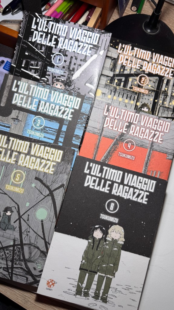
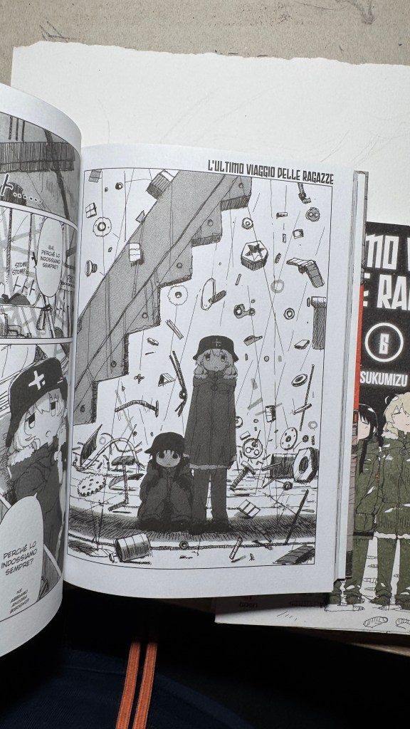
Sono anni che predico che i titoli originali di manga e libri vadano scritti con i kanji e non solo in rōmaji. L’ultimo viaggio delle ragazze gioca infatti sull’ambiguità della pronuncia “shūmatsu”, che all’orecchio può significare “fine settimana” oppure “fine del mondo”. Il titolo in kanji è 少女 終末 旅行, cioè “il viaggio delle ragazze fino all’apocalisse” (shūmatsuron è l’escatologia), ma potrebbe essere anche “la gita fuori porta nel weekend”.
Ed è su questo doppio senso che si basa Tsukumitsu, un vero volpone: i giapponesi sono entrati nel manga con una doppia attesa, o almeno un’aspettativa ambigua: sarà un racconto distopico, oppure uno slice of life? Noi no, ma oggettivamente era impossibile riprodurre l’omofonia in italiano (non dirò altro, perché questo piccolo capolavoro non va spoilerato in nessuna parte).
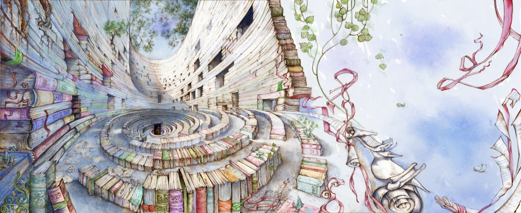
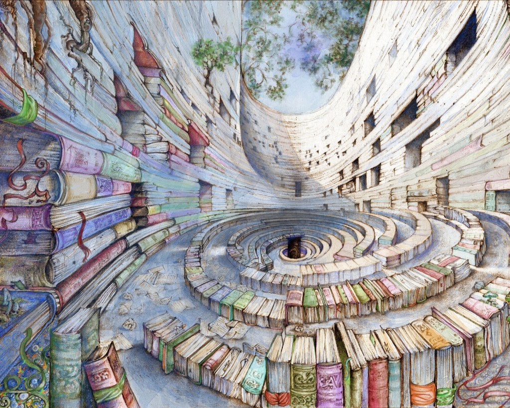
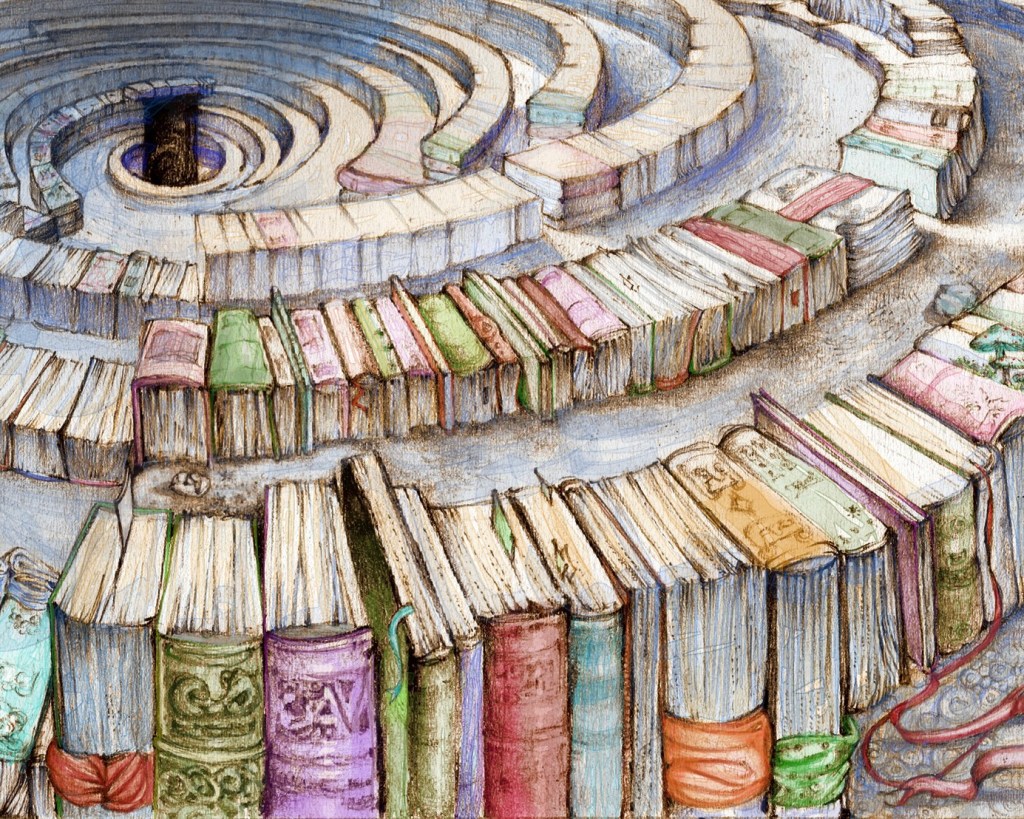
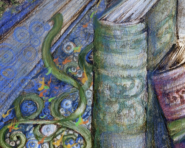
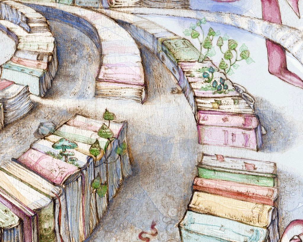
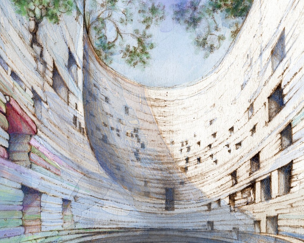
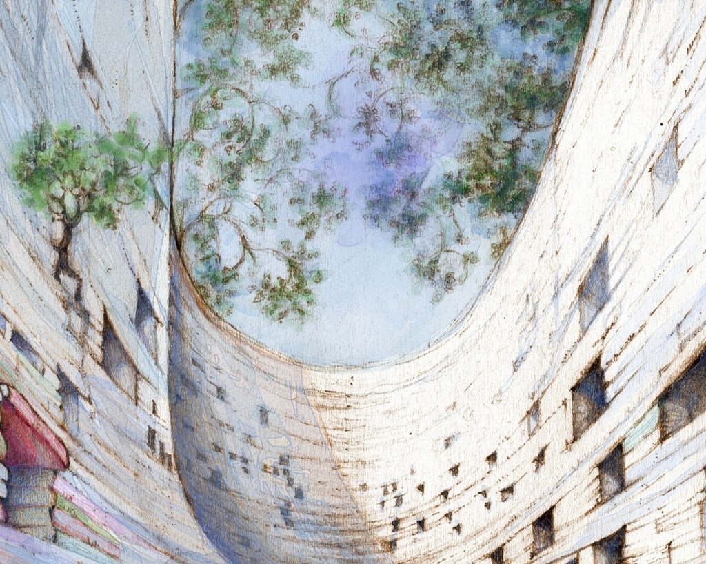
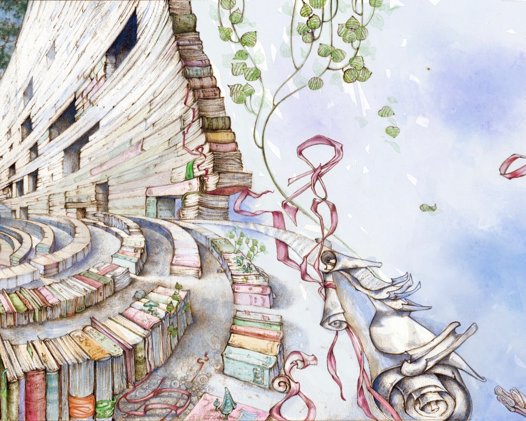
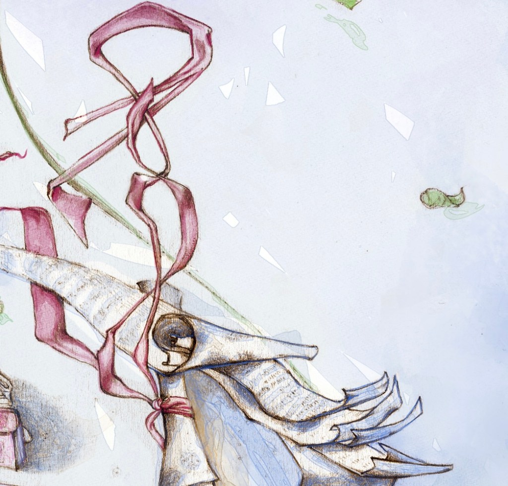
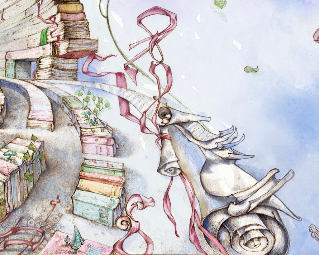
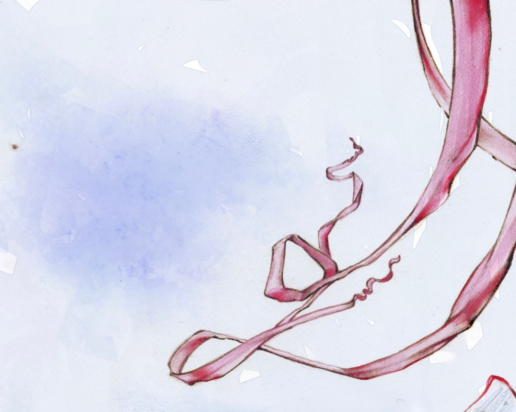
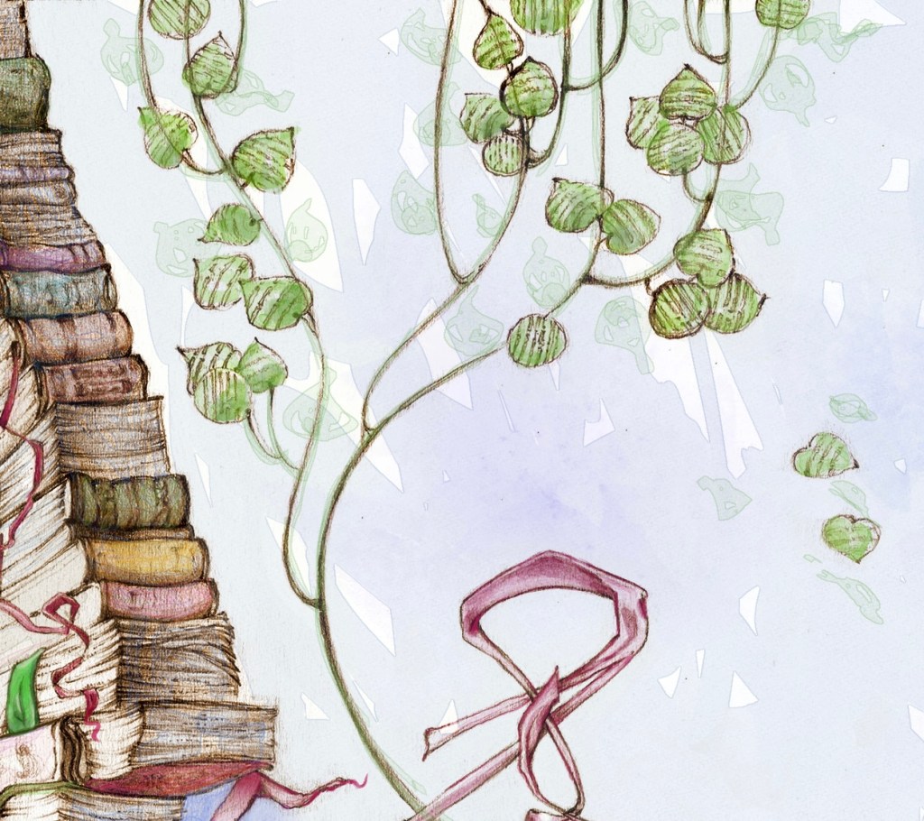
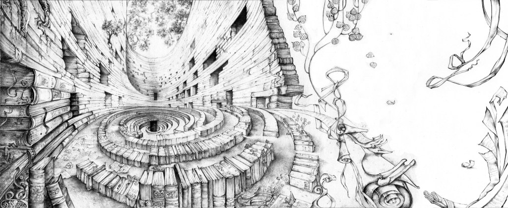
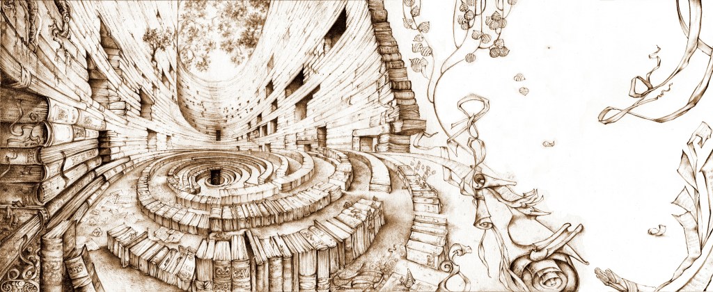
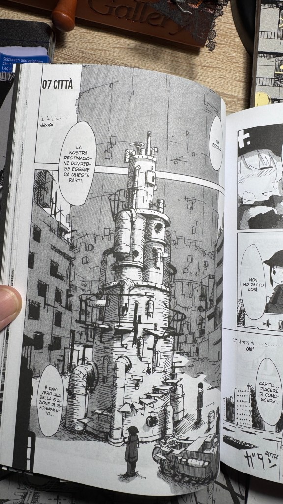
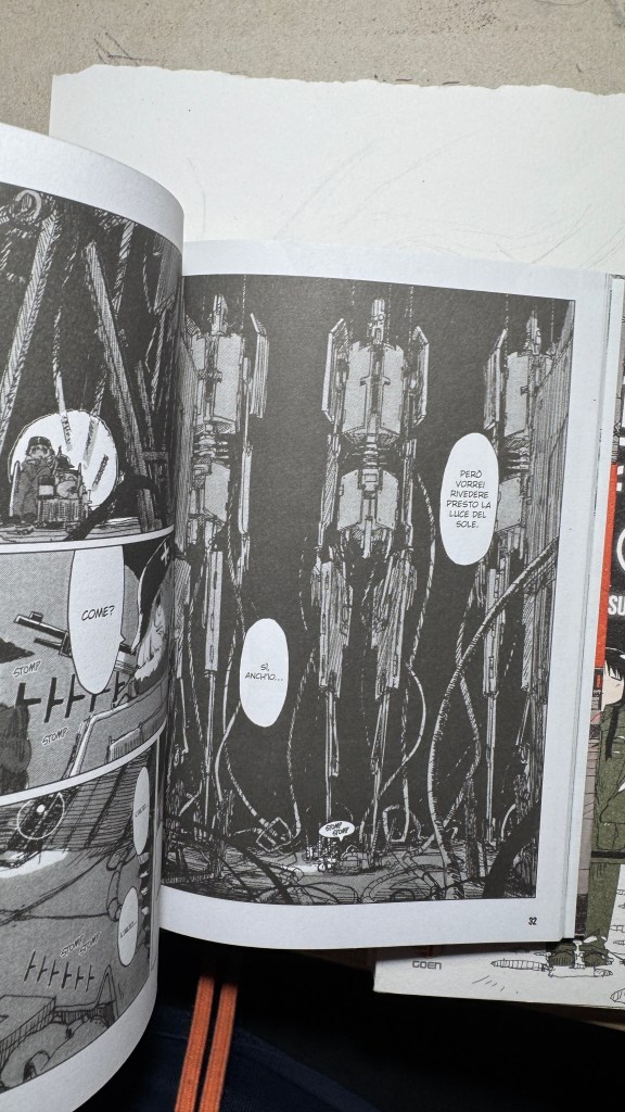
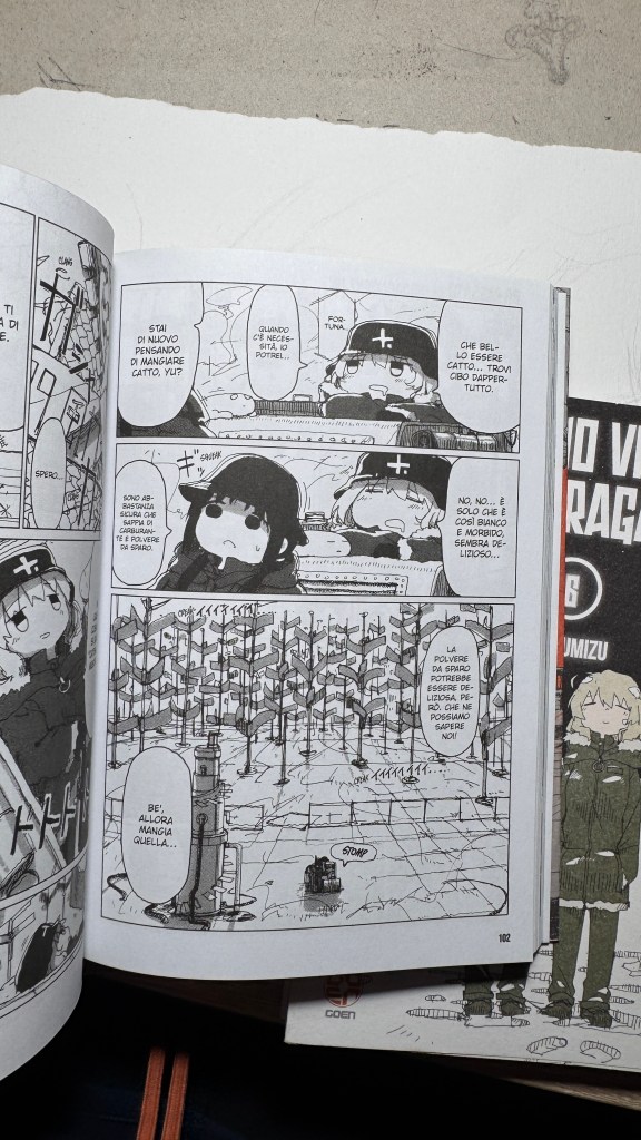
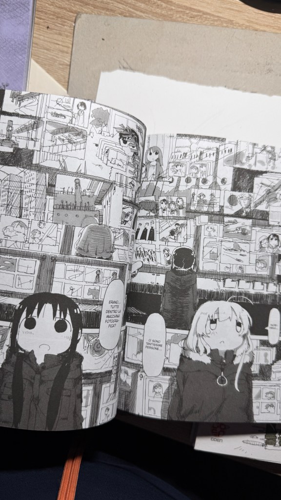
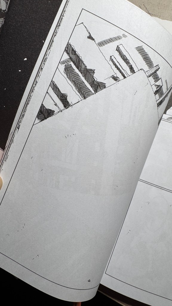
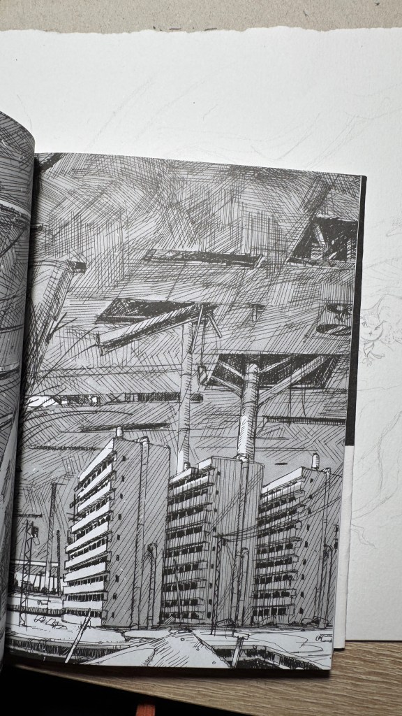
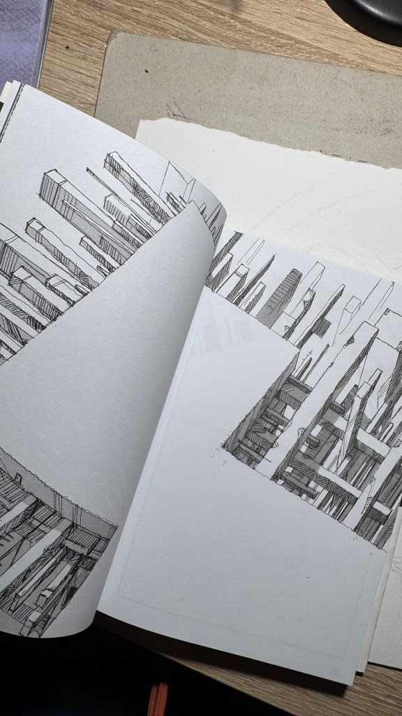
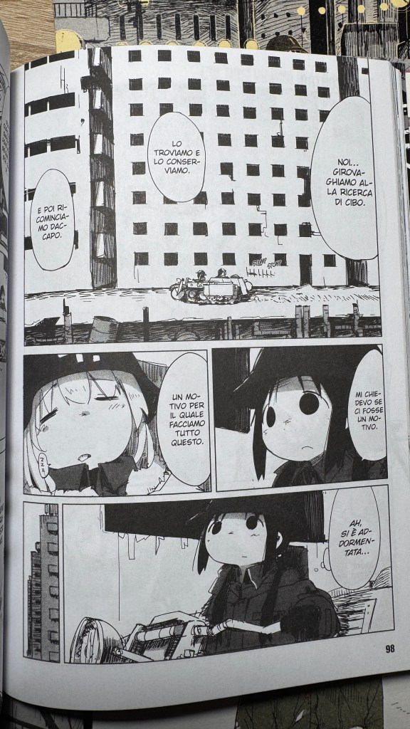
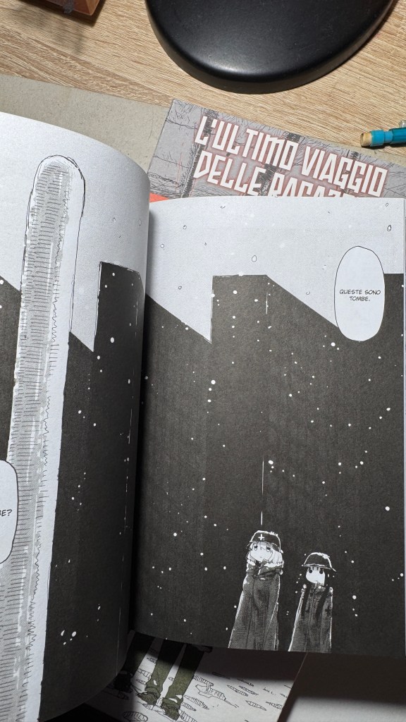
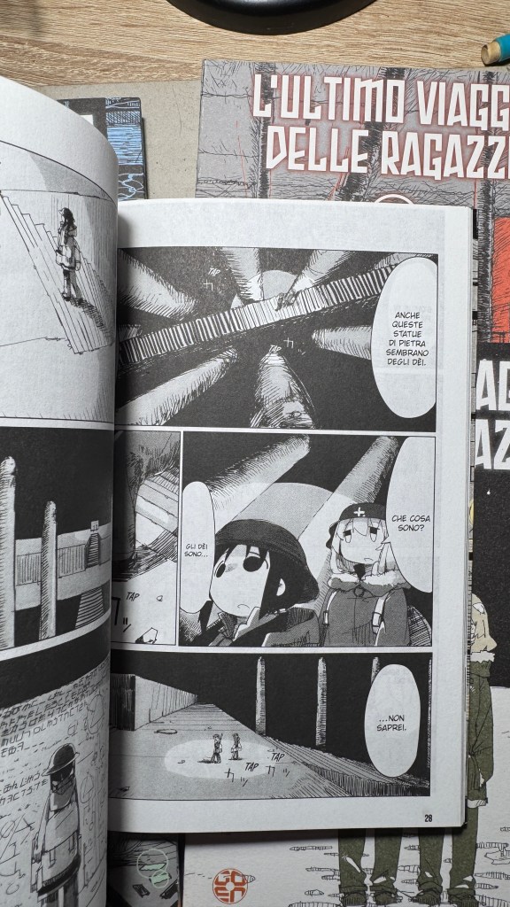
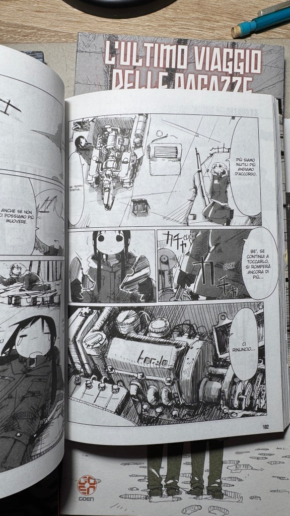
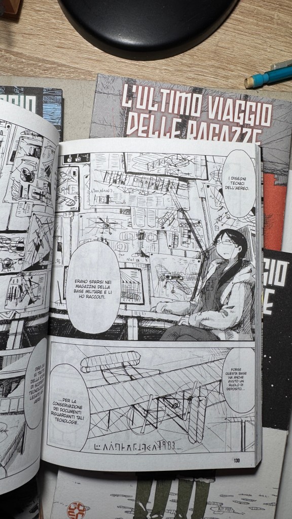
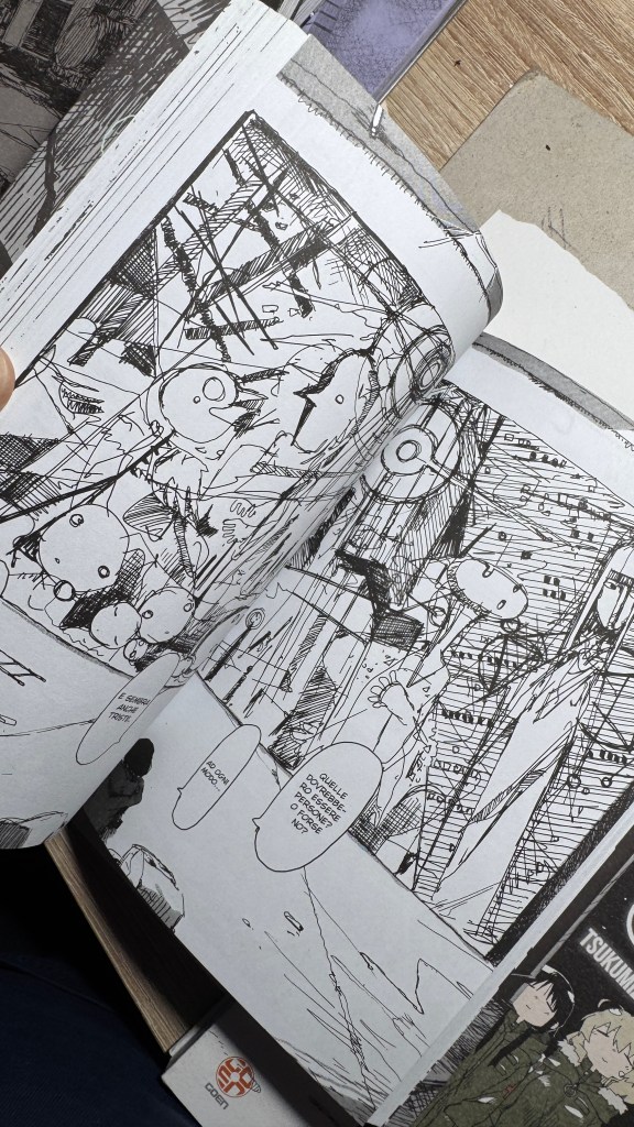
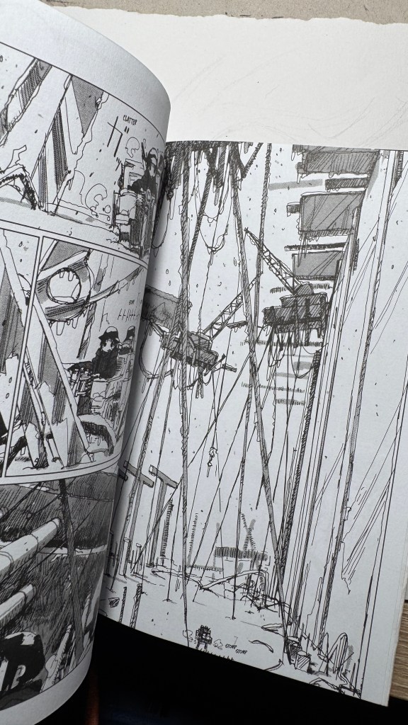
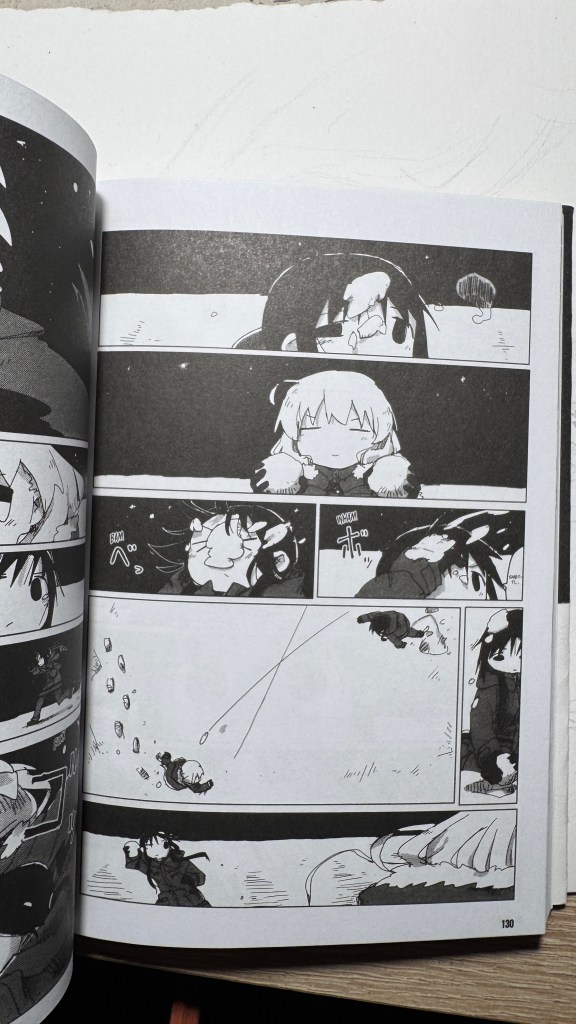
La cosa che balza immediatamente all’occhio è lo stile grafico: un tratto nervoso da real g-pen (Tsukumitsu lavora con Clip Studio Paint), affilato, tremolante e con una grande contrapposizione tra l’essenzialità quasi astratta dei volti delle ragazze, ottenuti da segni praticamente circolari, e l’affastellamento di dettagli degli sfondi. La piattezza grafica delle personagge si staglia contro una prospettiva profondissima che non può non ricordare Blame! e perfino il manga di Nausicaä.
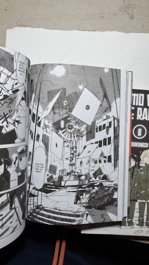
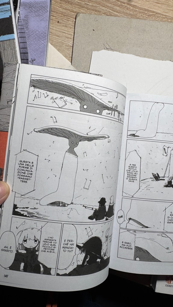
Subito capiamo che gli elementi “apocalisse+ gita fuori porta” sono contemporaneamente presenti grazie allo stile narrativo portato come uno slice of life, ma l’ambientazione è postapocalittica.
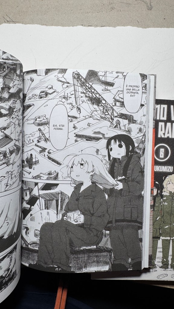
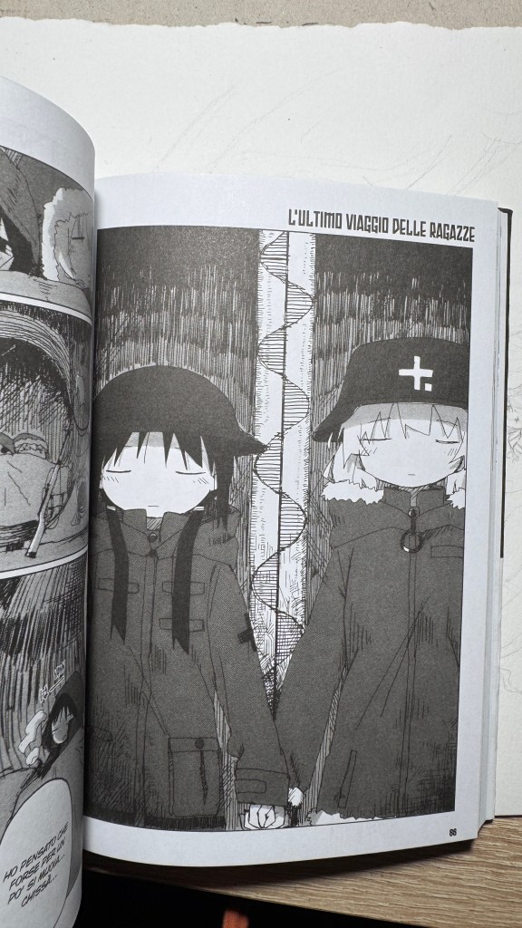
I contrasti non finiscono qui, perché Chito e Yuri sono antitetiche a loro volta, e nel loro comportamento, specie in Chito, c’è una certa crudeltà, violenza, mentre Yuri è più razionale e curiosa. Yuri e Chito sono sorelle (credo, o forse cugine). Potrebbe esserci un altro tipo di legame, io però non l’ho percepito, tuttavia alcune volte in italia il titolo è stato considerato inseribile tra gli “yuri-seinen”.
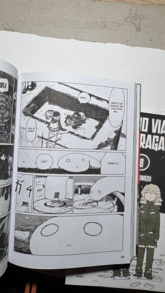
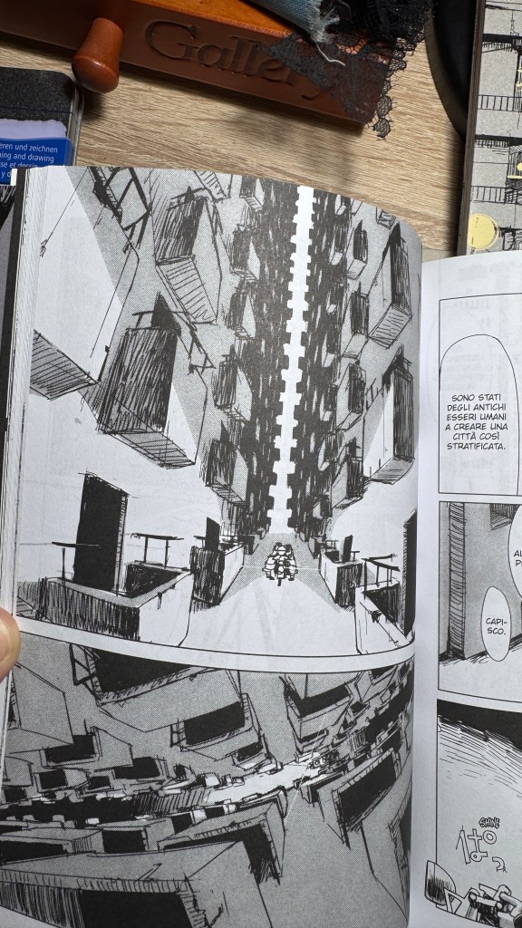
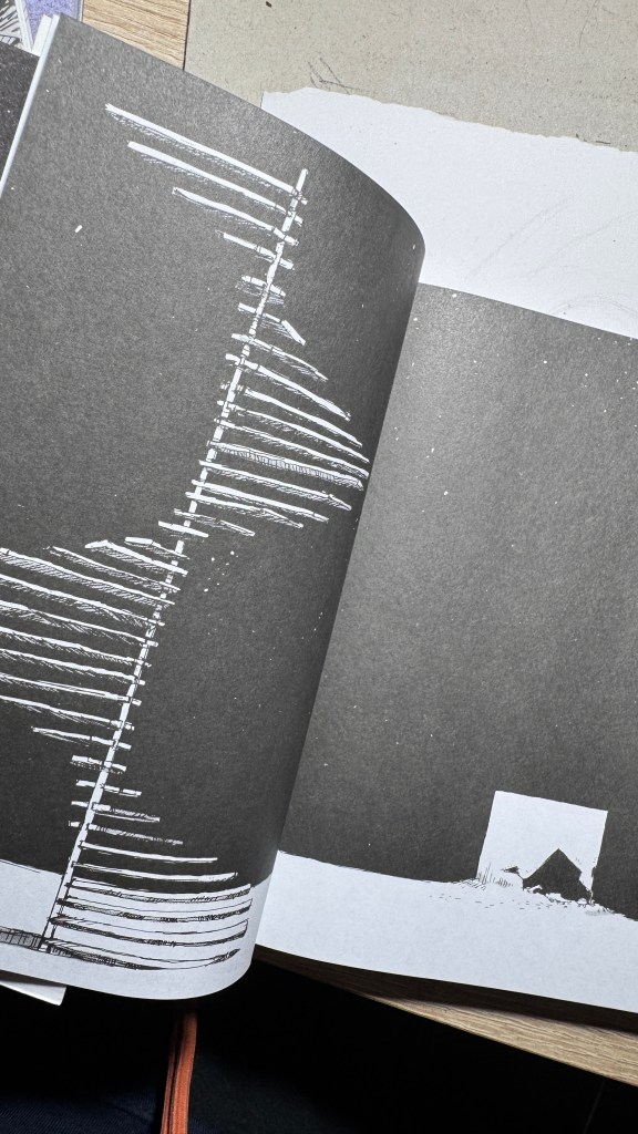
Analizzando attentamente si capisce quanto Tsukumitsu abbia letto di Arte, del manga classico e moderno e quanto impatto abbia avuto su di lui Akira Toriyama (a sua volta non esente dalle influenze dell’illustrazione occidentale di metà Novecento, come Norman Rockwell). Si potrebbe a volte pensare che lo stile di disegno sia frettoloso, in realtà è solo nervoso, ma mai impreciso, e anzi, è dettagliatissimo senza essere dovizioso o affastellato. Rivela anche una grande conoscenza della prospettiva e dell’anatomia: Tsukumitsu è la classica persona che pensa una cosa e la disegna come l’ha pensata, senza nessun riferimento. Non c’è riferimento possibile per quelle scenografie, se non nella propria fantasia. L’interpolazione grafica è attraverso il filtro della grande Arte Informale, di Joan Miró, Paul Klee, Picasso, Brancusi, il Razionalismo architettonico, Le Corbusier.
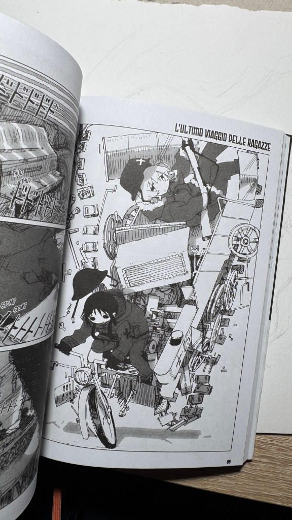
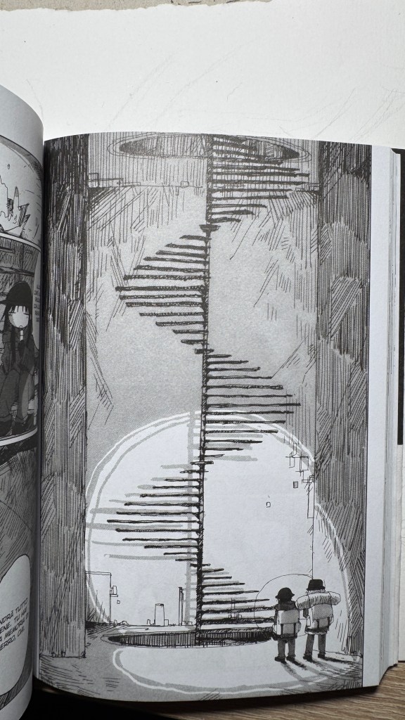
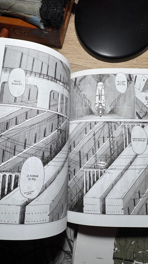
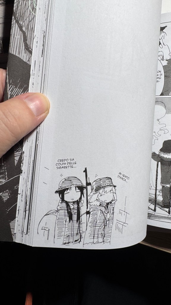
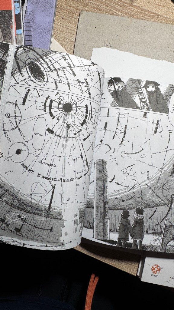
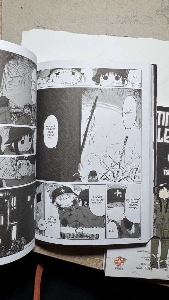
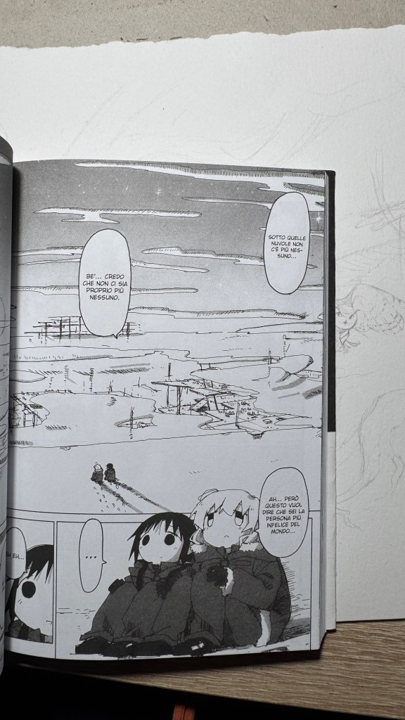
La gabbia sempre lineare e molto regolare rende il racconto ben scandito e semplice da seguire, ma anche distaccato, in modo che *l* lettor* non sia trasportato troppo dentro alla distruzione del mondo e si aggrappi invece al tepore dell’ingenuità delle due protagoniste. L’azione è scandita senza prospettive esagerate, appiattita quasi di forza per non essere mai “troppa” e generare contrasto con lo scenario. Questo è genio, eh. Il mondo distrutto viene narrato e attraversato come in una fiaba. Che volpone, Tsukumitsu!
Insomma, leggetelo, perché è veramente poetico.
“Girls’ Last Tour” by Tsukumizu, Goen Editions, a little-known gem
Scroll down for the English and Japanese versions (translated with ChatGPT)
I have been saying for years that original manga and book titles should be written with kanji, not just in rōmaji. Girls’ Last Tour plays on the ambiguity of the pronunciation shūmatsu, which to the ear can mean either “weekend” or “end of the world”. The title in kanji is 少女終末旅行, literally “the girls’ journey to the apocalypse” (shūmatsuron being eschatology), but it could also read as “a weekend outing trip”. And this double meaning is Tsukumizu’s sly trick: Japanese readers enter the manga with dual expectations – is it dystopian or slice‑of‑life? We couldn’t pull off the homophone in Italian, but Tsukumizu, a real fox, uses it masterfully. I won’t say more, this little masterpiece must stay spoiler‑free.
What immediately strikes the eye is the art style: a nervous line from a real g‑pen (Tsukumizu works with Clip Studio Paint), sharp, trembling, with a stark contrast between the almost abstract simplicity of the girls’ faces – formed by near‑circular strokes – and the pileup of background details. The flat graphical representation of the characters strikes a a profound perspective that inevitably evokes Blame! and even Nausicaä.
Then it becomes clear that the “apocalypse + weekend outing” elements exist simultaneously through a slice‑of‑life narrative style, despite the post‑apocalyptic setting.
The contrasts don’t end there. Chito and Yuri are antithetical: Chito sometimes shows cruelty and violence, while Yuri is more rational and curious. They seem like sisters (or maybe cousins). Some Italian fans have even classified the title as “yuri‑seinen,” though I didn’t perceive that myself.
A close reading reveals how deeply Tsukumizu has studied art and classic manga, and how much influence Akira Toriyama has had on them — in turn influenced by mid‑20th‑century Western illustrators like Norman Rockwell. The drawing style may sometimes appear hurried, but it is actually nervous and never sloppy. It is extremely detailed without being ornamental or cluttered. The work reveals a strong understanding of perspective and anatomy: Tsukumizu is the kind of creator who imagines something and draws it precisely as they’ve pictured it, with no external reference. Those scenographies are purely from imagination. The graphic interpolation is filtered through Informal Art giants like Joan Miró, Paul Klee, Picasso, Brâncuși, and architectural Rationalism — Le Corbusier.
The panels are always linear and very regular, making the story rhythmic and easy to follow but also detached—so the reader doesn’t get swept into the world’s destruction and instead holds onto the warmth of the girls’ innocence. The action is deliberately flattened—never “too much”—to contrast with the setting. This is genius. The destroyed world is narrated and traversed like in a fairy tale. What a fox, Tsukumizu!
🇯🇵 日本語訳
つくみず著『少女終末旅行』(Goen出版)、知る人ぞ知る小さな宝石
英語版と日本語版(ChatGPTによる翻訳)をスクロールしてご覧ください。
私はずっと、マンガや書籍の原題は漢字で書くべきで、ローマ字だけでは不十分だと主張してきました。『少女終末旅行』は「終末(しゅうまつ)」という発音の曖昧さを巧みに利用しています。「しゅうまつ」は耳では「週末=週末」か「終末=世界の終わり」のどちらにも聞こえます。タイトルの漢字は 少女終末旅行、文字通り「少女たちの終末への旅」(終末論=エシュカトロジー)ですが、「週末の遠足」としても読めます。この二重の意味こそがつくみずの狡猾さで、日本人読者は「これはディストピア? それともスライス・オブ・ライフ?」という二重期待を抱いて作品に入るのです。イタリア語では同音異義が再現できませんでしたが、つくみずは見事にそれを使いこなしています。これ以上は言いません。この小さな傑作はネタバレ厳禁です。
まず目を引くのはそのグラフィックスタイルです。実際のgペンのような緊張感ある線(つくみずはClip Studio Paint使用)、鋭く震えるようなタッチ、少女たちの顔はほぼ円形の記号で描かれた抽象的な構成、一方で背景には膨大なディテールがびっしり詰め込まれています。キャラクターの平面的表現と深遠な遠近法の背景との対比は、必然的に『BLAME!』や『風の谷のナウシカ』を想起させます。
次に気づかされるのは、「終末+週末の遠足」という要素が、スライス・オブ・ライフ的な語り口で同時に成立していることです。舞台は明らかにポスト・アポカリプスですが、淡々とした日常の延長として語られます。
対比はさらに深く、チトとユーリは相反する性格を持っています。チトには時に残酷さや暴力性が見え、ユーリはより理性的で好奇心旺盛。姉妹(あるいは従姉妹?)のような関係性ですが、イタリアでは“百合セイネン”として分類される場合もあります(私はそこまで感じませんでしたが)。
つくみずがいかに美術や古典マンガを読み込んでいるか、また鳥山明からどれほど影響を受け、その鳥山明がさらにノーマン・ロックウェルなど20世紀中頃の欧米イラストに影響されたかが見えてきます。描線は時にせっかちに見えて実は緊張感があり、決して不正確ではありません。装飾的でも雑でもない非常に緻密な描写で、遠近法や解剖学の知識も豊富です。つくみずは想像したものをそのまま紙に描くタイプの作家で、背景にモデルはありません。あの舞台装置はすべて彼らの想像力から生まれています。グラフィック表現にはミロ、クレー、ピカソ、ブランクーシといったアンフォルマルアートの巨匠、および建築ラショナリズム、ル・コルビュジエらの影響が感じられます。
コマ割りは常に直線的で整った構成なので、物語にリズムがあり読みやすく、それでいて距離感があります。読者が世界の破壊に“飲み込まれる”ことなく、少女たちの純粋な暖かさにしがみつけるように設計されています。アクションは意図的にフラットで“過剰”にならず、背景とのコントラストを生んでいます。これが天才的なんです。壊れた世界は、まるでおとぎ話のように語られ、歩む。つくみず、なんてずる賢いんだ!