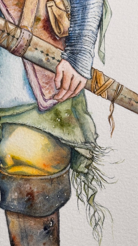
Ci sono solo due libri che non ho mai riletto per paura di non ritrovarli così belli come da ragazza. Il primo è “La mano sinistra delle tenebre“, di Le Guin, il secondo è “Donna di spade” di Pederiali.
In “Donna di spade” c’è un bellissimo personaggio, Sciagiarra. Memorabile.
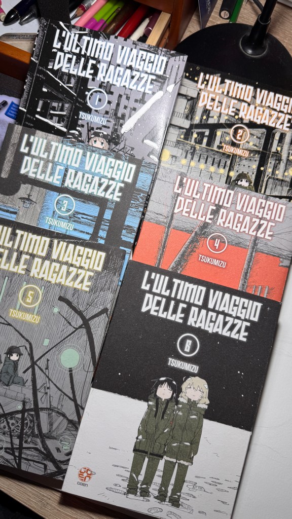
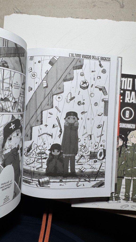
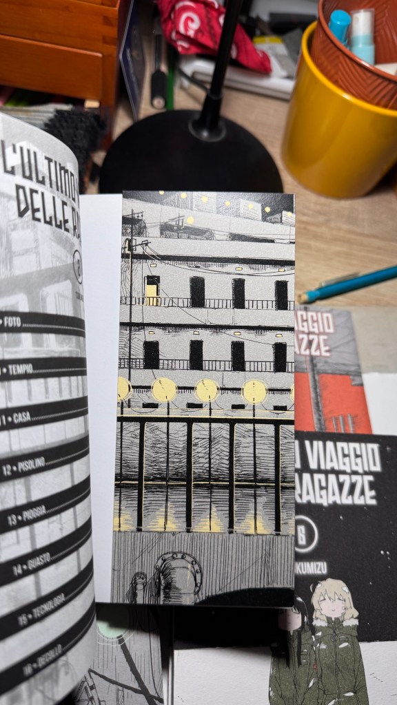
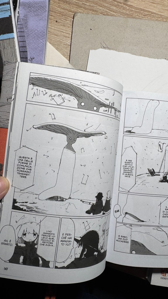
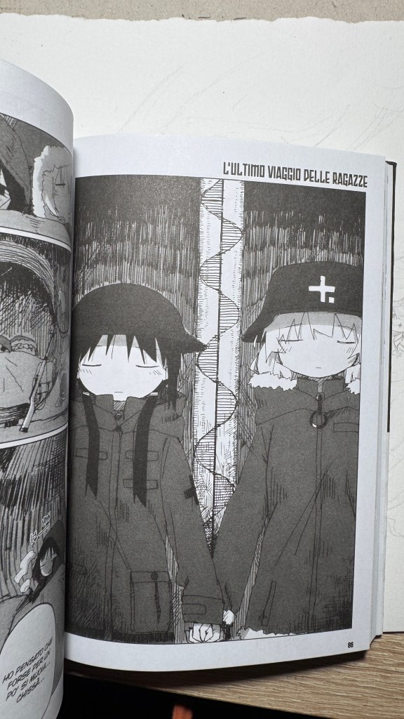
Sono anni che predico che i titoli originali di manga e libri vadano scritti con i kanji e non solo in rōmaji. L’ultimo viaggio delle ragazze gioca infatti sull’ambiguità della pronuncia “shūmatsu”, che all’orecchio può significare “fine settimana” oppure “fine del mondo”. Il titolo in kanji è 少女 終末 旅行, cioè “il viaggio delle ragazze fino all’apocalisse” (shūmatsuron è l’escatologia), ma potrebbe essere anche “la gita fuori porta nel weekend”.
Ed è su questo doppio senso che si basa Tsukumitsu, un vero volpone: i giapponesi sono entrati nel manga con una doppia attesa, o almeno un’aspettativa ambigua: sarà un racconto distopico, oppure uno slice of life? Noi no, ma oggettivamente era impossibile riprodurre l’omofonia in italiano (non dirò altro, perché questo piccolo capolavoro non va spoilerato in nessuna parte).
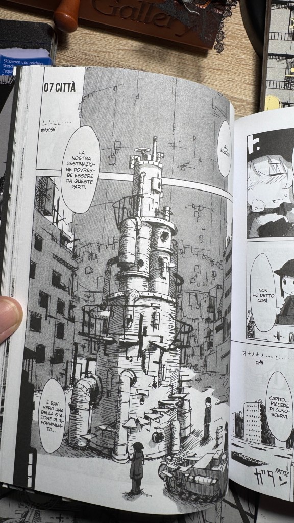
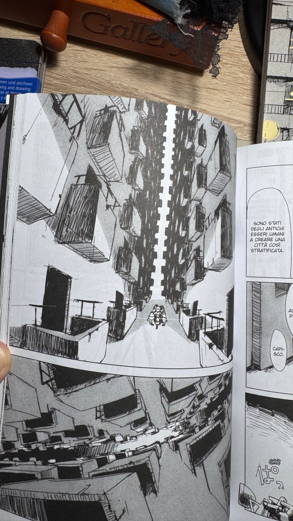
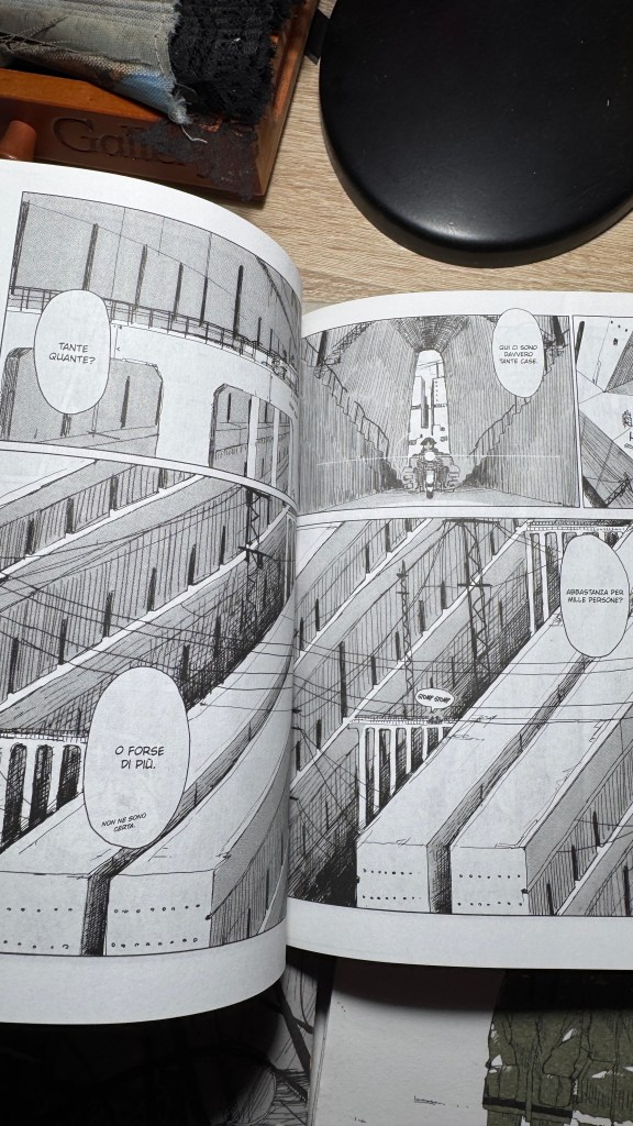
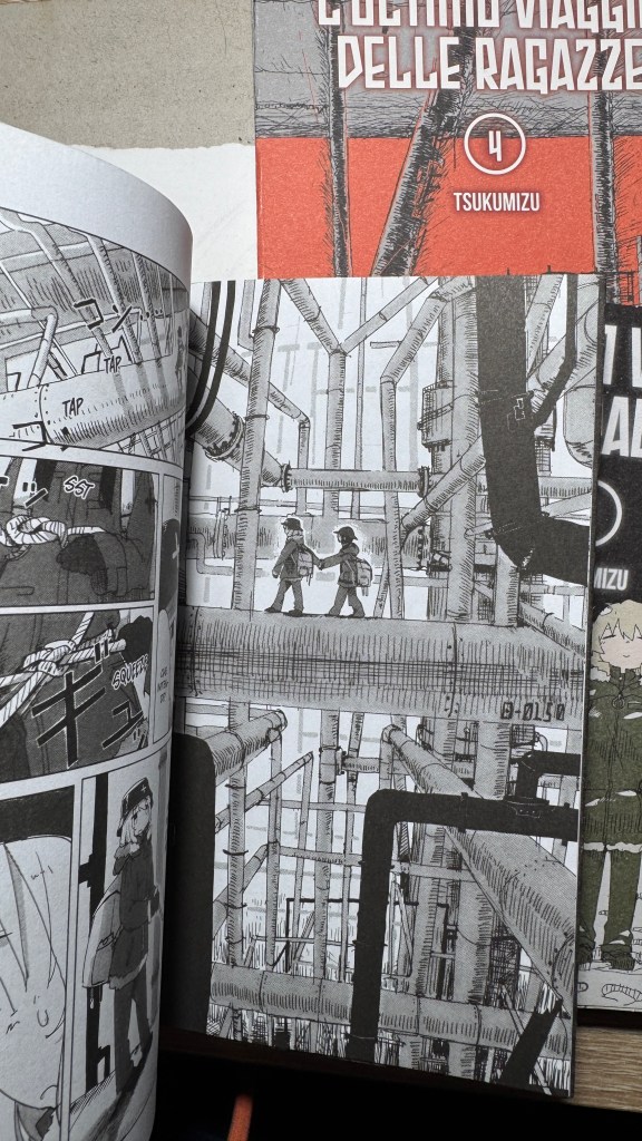
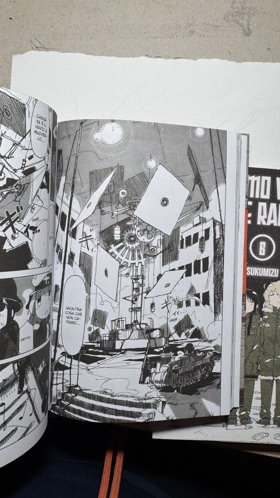
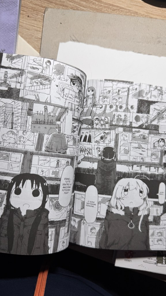
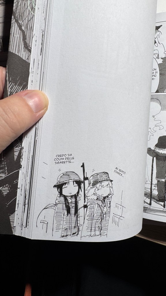
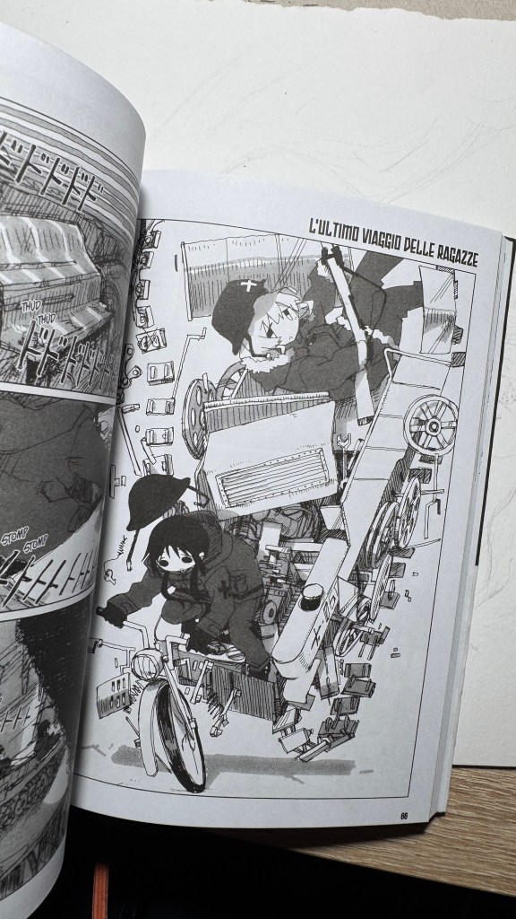
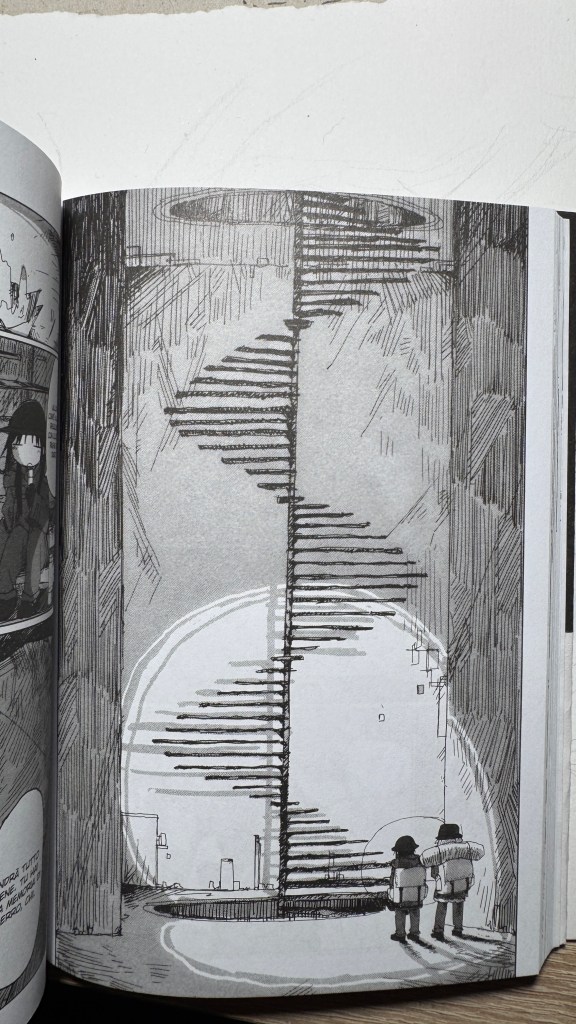
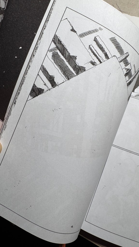
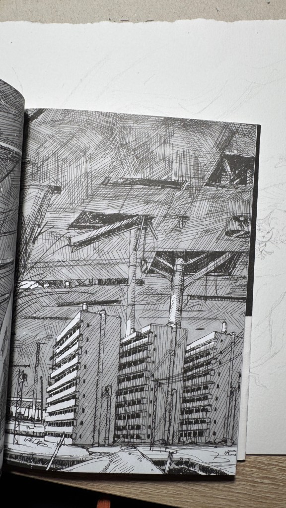
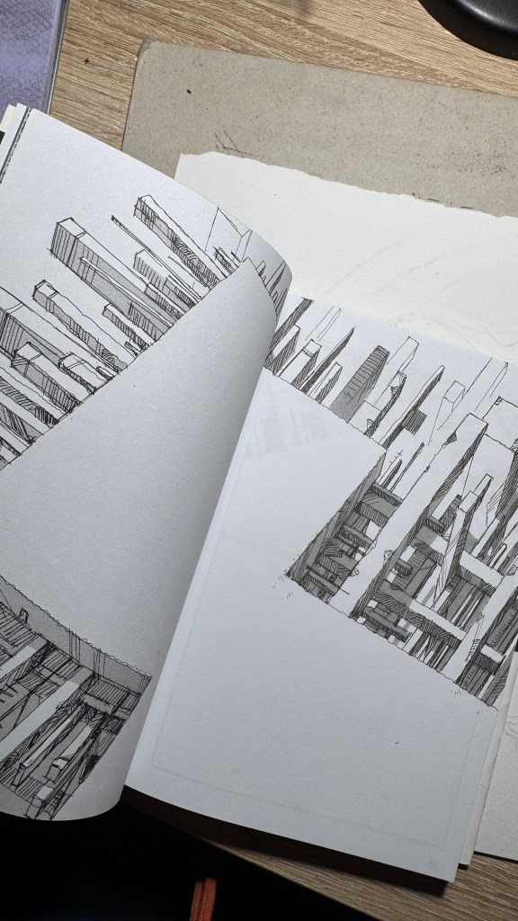
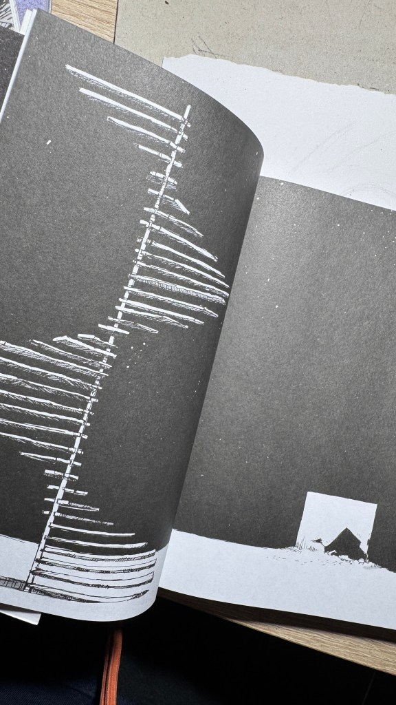
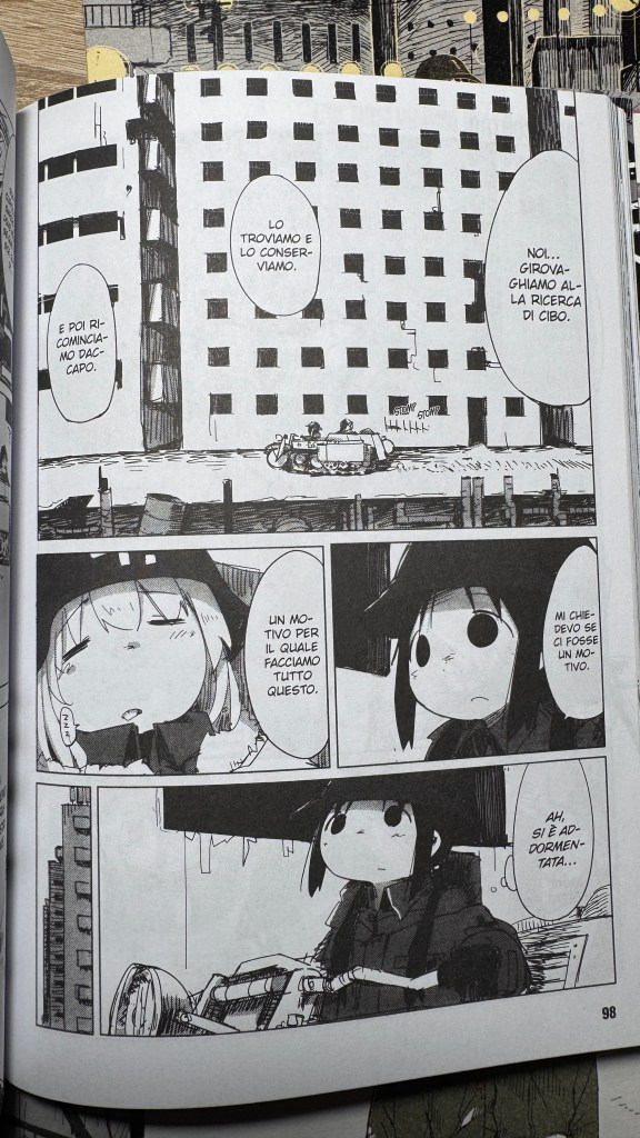
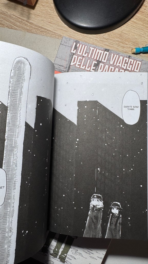
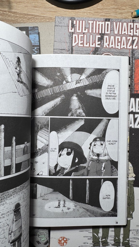
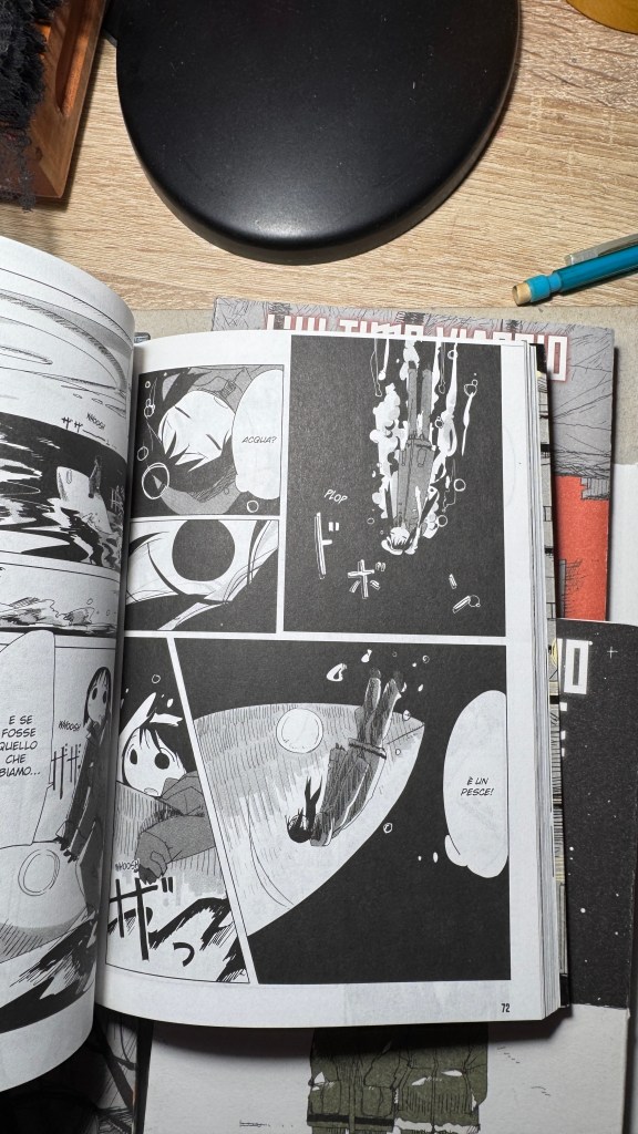
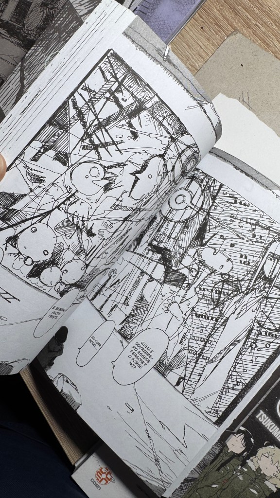
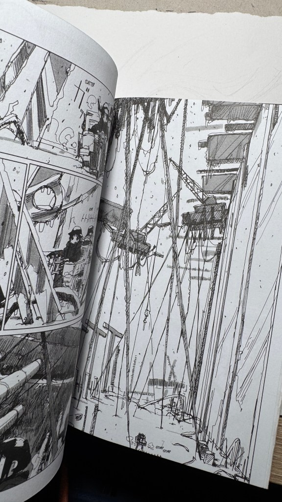
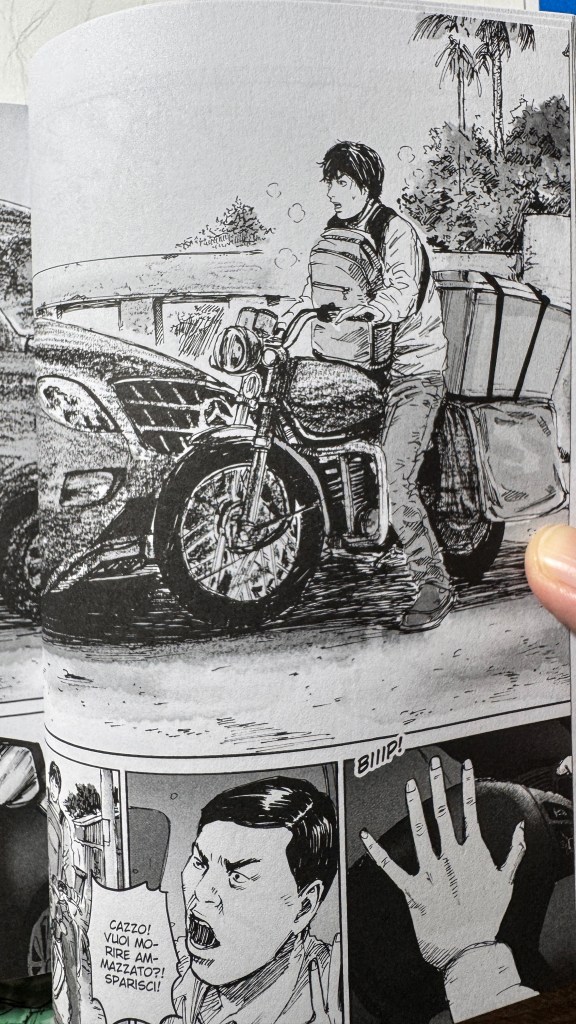
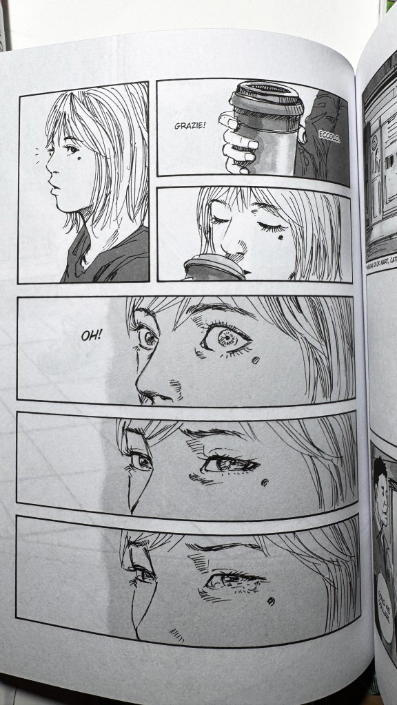
La cosa che balza immediatamente all’occhio è lo stile grafico: un tratto nervoso da real g-pen (Tsukumitsu lavora con Clip Studio Paint), affilato, tremolante e con una grande contrapposizione tra l’essenzialità quasi astratta dei volti delle ragazze, ottenuti da segni praticamente circolari, e l’affastellamento di dettagli degli sfondi. La piattezza grafica delle personagge si staglia contro una prospettiva profondissima che non può non ricordare Blame! e perfino il manga di Nausicaä.
Subito capiamo che gli elementi “apocalisse+ gita fuori porta” sono contemporaneamente presenti grazie allo stile narrativo portato come uno slice of life, ma l’ambientazione è postapocalittica.
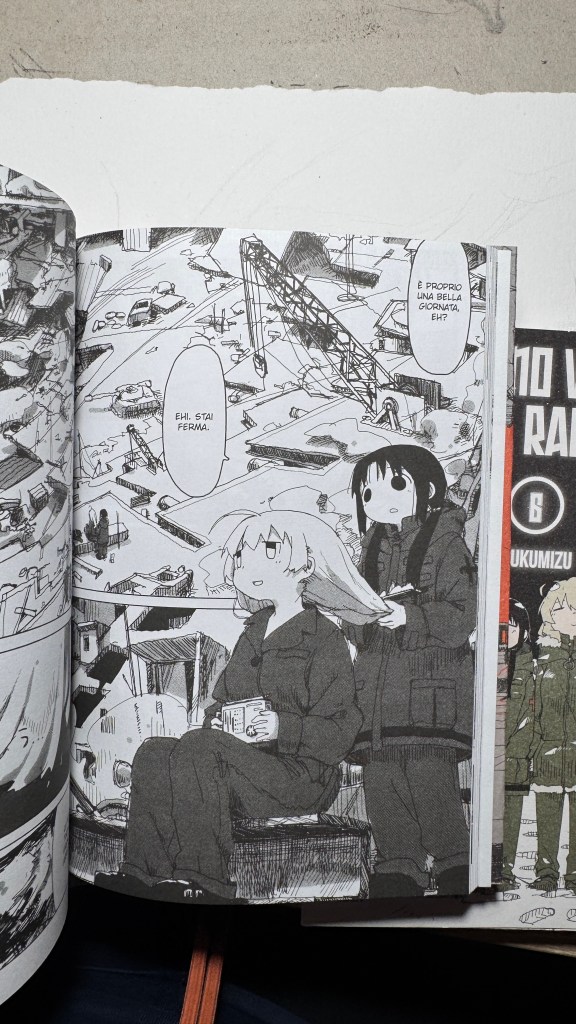
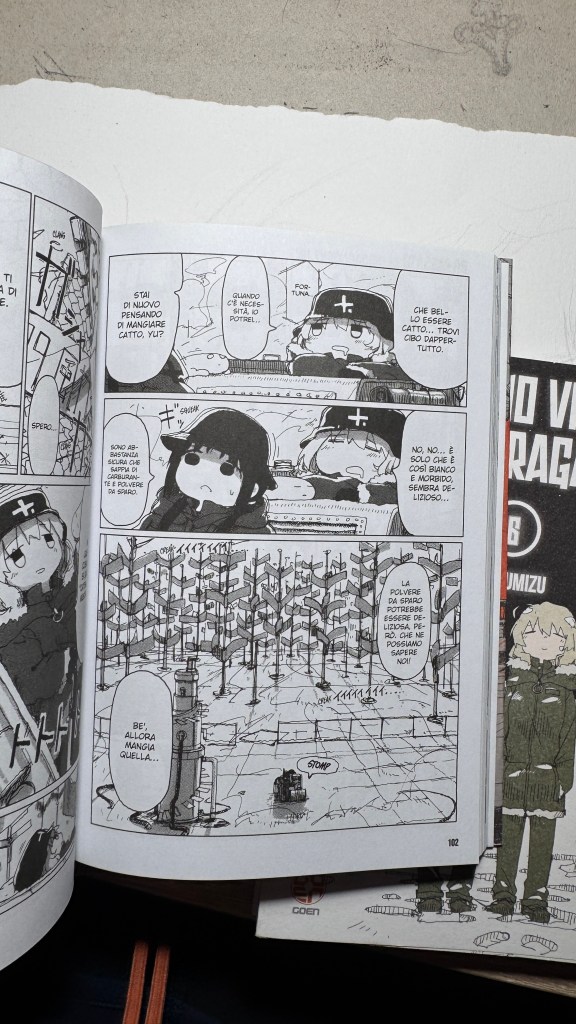
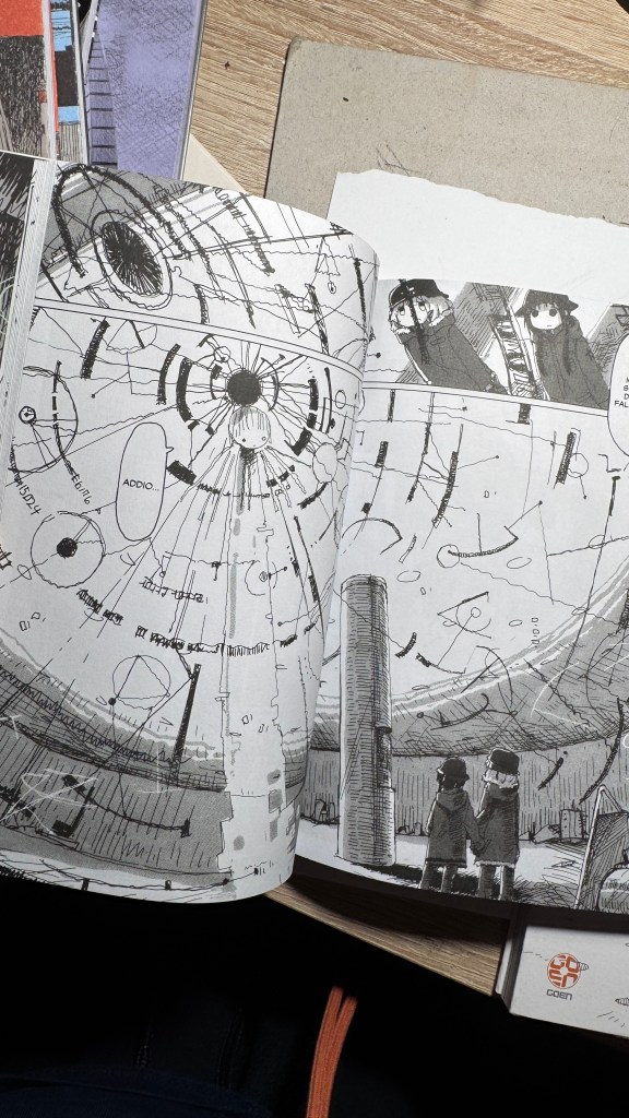
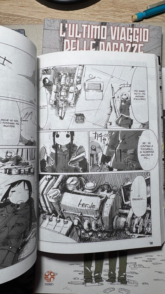
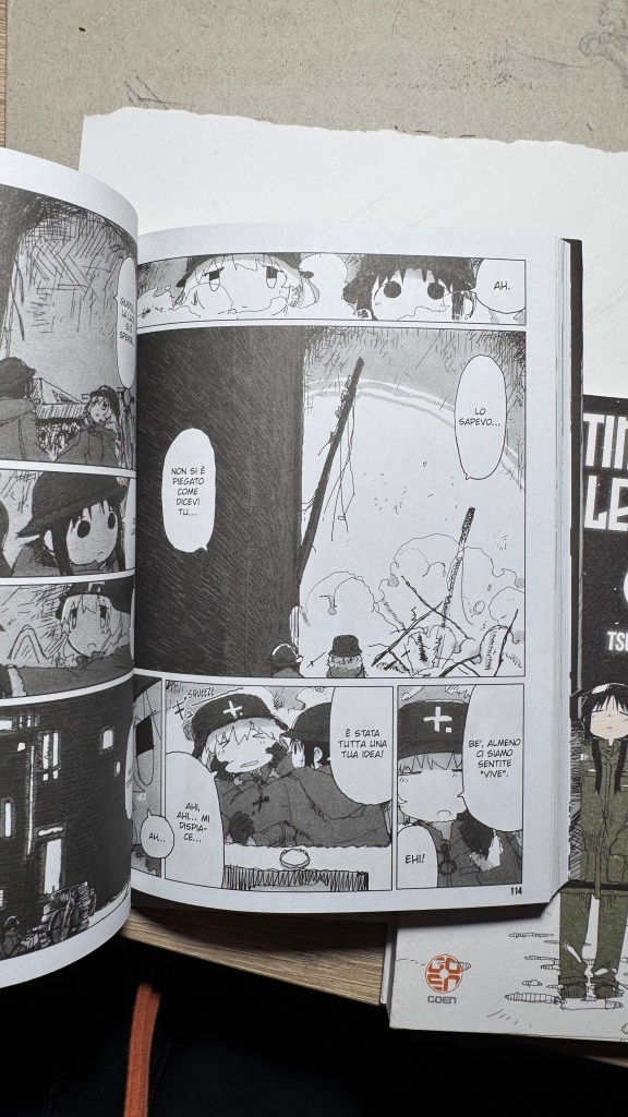
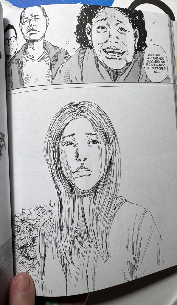
I contrasti non finiscono qui, perché Chito e Yuri sono antitetiche a loro volta, e nel loro comportamento, specie in Chito, c’è una certa crudeltà, violenza, mentre Yuri è più razionale e curiosa. Yuri e Chito sono sorelle (credo, o forse cugine). Potrebbe esserci un altro tipo di legame, io però non l’ho percepito, tuttavia alcune volte in italia il titolo è stato considerato inseribile tra gli “yuri-seinen”.
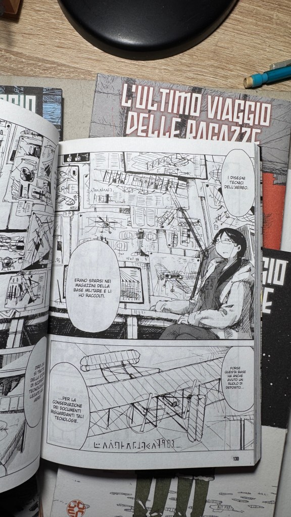
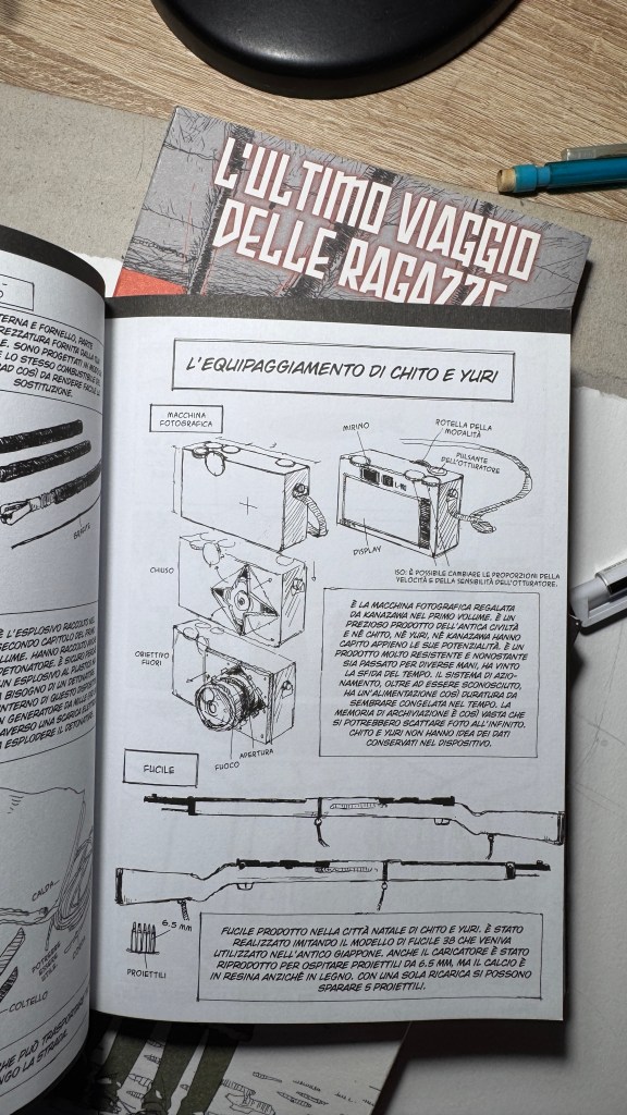
Analizzando attentamente si capisce quanto Tsukumitsu abbia letto di Arte, del manga classico e moderno e quanto impatto abbia avuto su di lui Akira Toriyama (a sua volta non esente dalle influenze dell’illustrazione occidentale di metà Novecento, come Norman Rockwell). Si potrebbe a volte pensare che lo stile di disegno sia frettoloso, in realtà è solo nervoso, ma mai impreciso, e anzi, è dettagliatissimo senza essere dovizioso o affastellato. Rivela anche una grande conoscenza della prospettiva e dell’anatomia: Tsukumitsu è la classica persona che pensa una cosa e la disegna come l’ha pensata, senza nessun riferimento. Non c’è riferimento possibile per quelle scenografie, se non nella propria fantasia. L’interpolazione grafica è attraverso il filtro della grande Arte Informale, di Joan Miró, Paul Klee, Picasso, Brancusi, il Razionalismo architettonico, Le Corbusier.
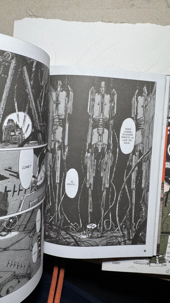
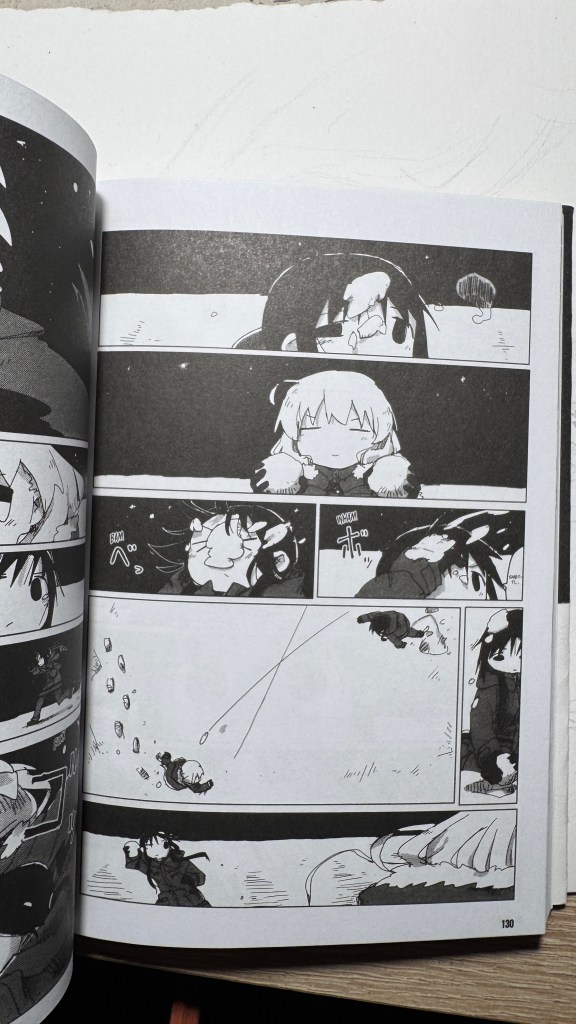
La gabbia sempre lineare e molto regolare rende il racconto ben scandito e semplice da seguire, ma anche distaccato, in modo che *l* lettor* non sia trasportato troppo dentro alla distruzione del mondo e si aggrappi invece al tepore dell’ingenuità delle due protagoniste. L’azione è scandita senza prospettive esagerate, appiattita quasi di forza per non essere mai “troppa” e generare contrasto con lo scenario. Questo è genio, eh. Il mondo distrutto viene narrato e attraversato come in una fiaba. Che volpone, Tsukumitsu!
Insomma, leggetelo, perché è veramente poetico.
“Girls’ Last Tour” by Tsukumizu, Goen Editions, a little-known gem
Scroll down for the English and Japanese versions (translated with ChatGPT)
I have been saying for years that original manga and book titles should be written with kanji, not just in rōmaji. Girls’ Last Tour plays on the ambiguity of the pronunciation shūmatsu, which to the ear can mean either “weekend” or “end of the world”. The title in kanji is 少女終末旅行, literally “the girls’ journey to the apocalypse” (shūmatsuron being eschatology), but it could also read as “a weekend outing trip”. And this double meaning is Tsukumizu’s sly trick: Japanese readers enter the manga with dual expectations – is it dystopian or slice‑of‑life? We couldn’t pull off the homophone in Italian, but Tsukumizu, a real fox, uses it masterfully. I won’t say more, this little masterpiece must stay spoiler‑free.
What immediately strikes the eye is the art style: a nervous line from a real g‑pen (Tsukumizu works with Clip Studio Paint), sharp, trembling, with a stark contrast between the almost abstract simplicity of the girls’ faces – formed by near‑circular strokes – and the pileup of background details. The flat graphical representation of the characters strikes a a profound perspective that inevitably evokes Blame! and even Nausicaä.
Then it becomes clear that the “apocalypse + weekend outing” elements exist simultaneously through a slice‑of‑life narrative style, despite the post‑apocalyptic setting.
The contrasts don’t end there. Chito and Yuri are antithetical: Chito sometimes shows cruelty and violence, while Yuri is more rational and curious. They seem like sisters (or maybe cousins). Some Italian fans have even classified the title as “yuri‑seinen,” though I didn’t perceive that myself.
A close reading reveals how deeply Tsukumizu has studied art and classic manga, and how much influence Akira Toriyama has had on them — in turn influenced by mid‑20th‑century Western illustrators like Norman Rockwell. The drawing style may sometimes appear hurried, but it is actually nervous and never sloppy. It is extremely detailed without being ornamental or cluttered. The work reveals a strong understanding of perspective and anatomy: Tsukumizu is the kind of creator who imagines something and draws it precisely as they’ve pictured it, with no external reference. Those scenographies are purely from imagination. The graphic interpolation is filtered through Informal Art giants like Joan Miró, Paul Klee, Picasso, Brâncuși, and architectural Rationalism — Le Corbusier.
The panels are always linear and very regular, making the story rhythmic and easy to follow but also detached—so the reader doesn’t get swept into the world’s destruction and instead holds onto the warmth of the girls’ innocence. The action is deliberately flattened—never “too much”—to contrast with the setting. This is genius. The destroyed world is narrated and traversed like in a fairy tale. What a fox, Tsukumizu!
まず目を引くのはそのグラフィックスタイルです。実際のgペンのような緊張感ある線(つくみずはClip Studio Paint使用)、鋭く震えるようなタッチ、少女たちの顔はほぼ円形の記号で描かれた抽象的な構成、一方で背景には膨大なディテールがびっしり詰め込まれています。キャラクターの平面的表現と深遠な遠近法の背景との対比は、必然的に『BLAME!』や『風の谷のナウシカ』を想起させます。
向下滚动阅读中文版本。由 ChatGPT 翻译。Scroll for the English version (translated with ChatGPT)
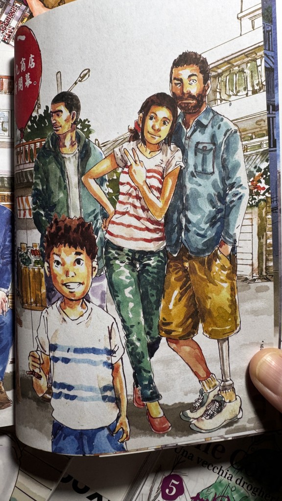
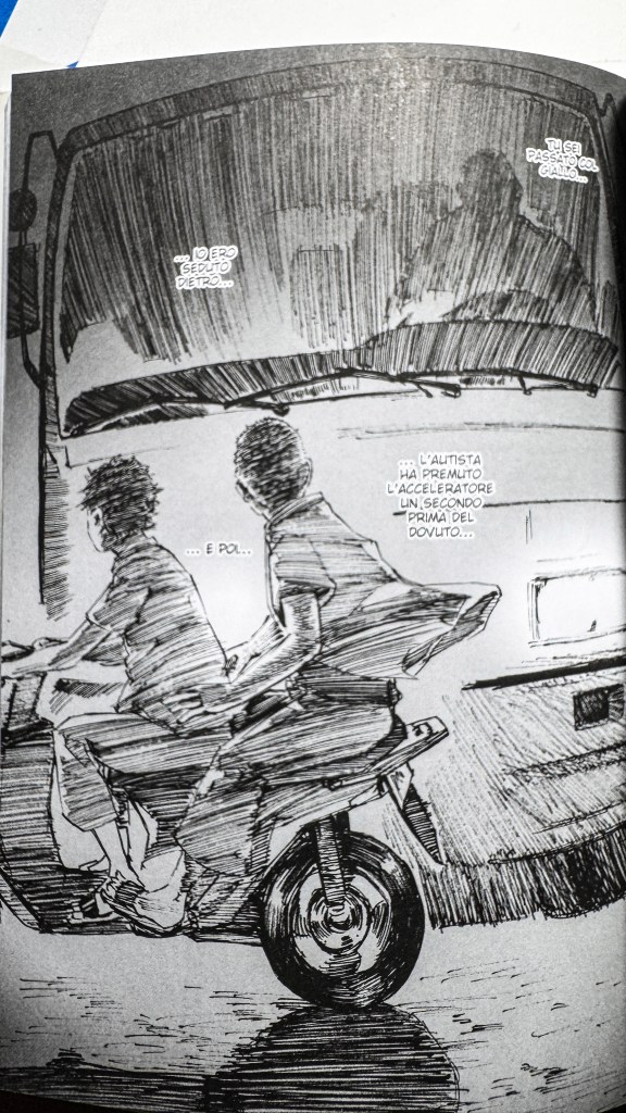
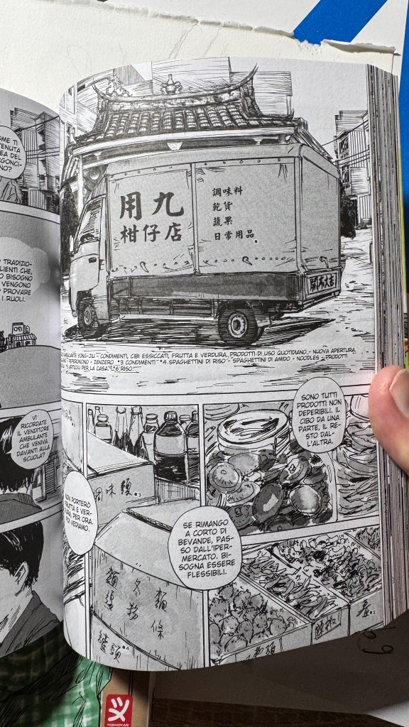
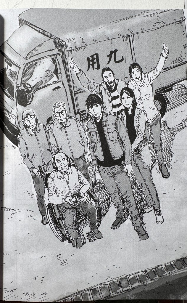
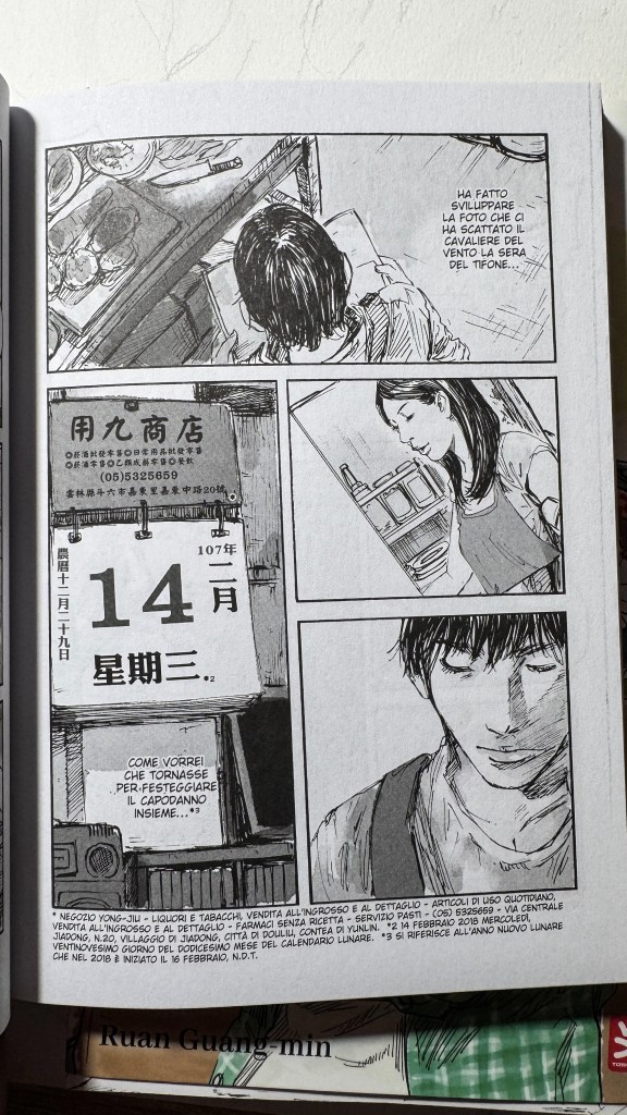
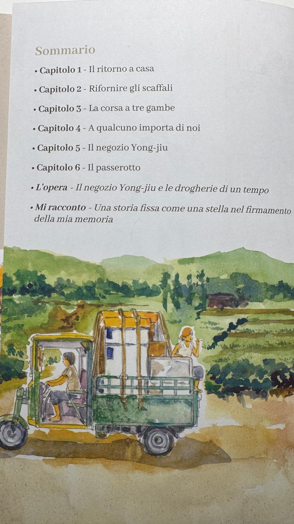
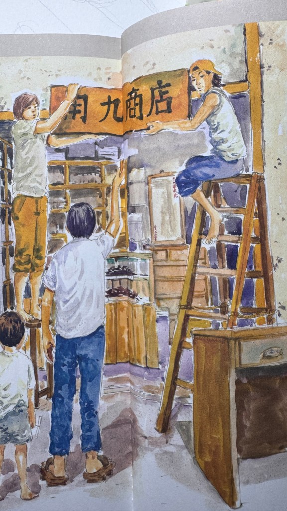
The corner store. Una vecchia drogheria è una delle uscite migliori degli ultimi anni. Sorprendente è dire poco. Ruan Guang-min, un autore taiwanese, porta in scena un insieme di personaggi normali, comunissimi, e certamente più interessanti dei vari superpotenziati che abitano i manga giapponesi. Il manhua taiwanese è largamente inesplorato in Italia, anche in alcune delle sue vette artistiche (come Chen Uen o Little Thunder). Da pochi anni la casa editrice Toshokan ne sta traducendo alcuni, con grandissimo favore del pubblico più maturo e raffinato.Guang-min è molto noto in patria per avere centrato storie corali imperniate su piccole attività commerciali di famiglia, ha vinto numerosi premi e i suoi manhua vengono trasposti in serie televisive. The corner store sente certamente l’andamento del drama, dello sceneggiato, non solo nel succedersi degli eventi, ma anche della scansione dell’azione in pagina, della prospettiva, dell’inquadratura. Guang-min è senza alcun dubbio uno dei migliori artisti che circolano tra gli scaffali italiani, la sua tecnica di disegno è sorprendente per l’efficacia, per l’icasticità, la velocità con cui la rappresentazione raffigurata diventa vivida, reale, vicina. La sua capacità di far correre l’occhio e la lettura è straordinaria. In questo lo ritengo supremo, inarrivabile.
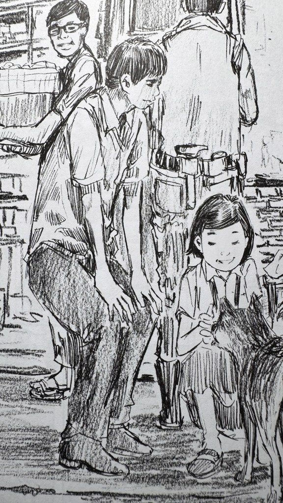
Lui disegna in digitale ma il tratto rimane sempre molto artigianale, con delle sporcature tipiche del carboncino, della matita grassa passata di taglio sul cartoncino ruvido. Non si perdono le linee ravvicinate dello schizzo a matita e a pennino, le finezze del pennello. Una attenzione allo strumento utilizzato che è praticamente ignota a molti mangaka giapponesi, che ci danno sempre un tratto fine e pulito, perfetto e anonimo, e che in Europa viene invece molto apprezzata poiché segno caratteristico e distintivo di una sola mano, di un unico individuo. L’unicità, la riconoscibilità, è sempre un elemento positivo per l’occhio europeo, poiché avvicina l’artista alla creazione divina.
L’emozione che mi ha suscitato questo manga è di una immensa nostalgia di qualcosa che non ho mai posseduto. Sono una X Gen, i “corner store” esistevano ai miei tempi, anzi, non c’era altro tipo di negozio. Si chiamavano “bottega”, “emporio”, “spaccio”, o meglio ancora, con il nome del proprietario. “Vado dal Carlino, dal Ieraci, da Torre”, oppure si usava il soprannome paesano “il Magnamagna”, “il Brigante”.
Per me erano posti terribili, dove andare perché necessario, per una richiesta ricevuta in famiglia, che per una bambina diventa un ordine. Lì dentro mi sentivo un agnello il mezzo ai lupi, un pezzo di carne da pesare, una merce da poter acquistare semplicemente prendendola dallo scaffale. Sin da piccola sentivo il puzzolente fiato del patriarcato sul mio collo. Gli sguardi sezionatori dei “vecchi” (magari quarantenni) che indugiavano sul mio corpo di scolara elementare come se fossi una sugosa pietanza ambulante. Le donne adulte o erano acquirenti, quindi di passaggio, oppure mogli dei titolari, quindi ipostasi dei mariti. Le bambine non sarebbero state ammesse in bottega, nemmeno se figlie del titolare. Troppi maschi, troppi vizi, alcool, sigarette, possibilità di violenza, e non ultima, la vicinanza al mondo del danaro, dell’attività commerciale, da cui le femmine venivano accuratamente tenute lontane.
Perciò il pensiero che avrei potuto aspettare il bus alla bottega, o fare i compiti assieme agli altri bambini, mangiucchiando biscotti, come hanno fatto i protagonisti di The corner store, mi ha letteralmente assestato una coltellata nelle costole. A me, questa vita, questi ricordi, che probabilmente sono condivisi da molti miei coetanei maschi, sono stati negati poiché nata femmina. E mi chiedo quanta distanza ci sia tra i negozietti d’angolo della remota provincia calabrese degli anni ’70-’80 e quelli della provincia taiwanese di qualche anno fa. Mi chiedo se le millennial di Taiwan abbiano sentito anche loro il peso dello sguardo maschile andando a prendere un ghiacciolo. E inevitabilmente mi dico di sì.
E questa cosa mi fa arrabbiare, e mi addolora.
Nel racconto di Guang-min i personaggi femminili non mancano, ma quelli importanti sono solo tre rispetto agli innumerevoli maschi. Tutte e tre sono legate a temi romantici, e una soltanto ha una caratterizzazione forte al di fuori della sfera sentimentale. Se tra i maschi avvengono dialoghi e considerazioni sul senso della vita, sui propri sentimenti e sul commercio, questo non avviene tra i personaggi femminili, che si sovrappongono o si lambiscono occasionalmente, spesso senza avere una reale interazione che non sia la condivisione dello spazio nella pagina. Manca anche un analogo rapporto intergenerazionale che si sviluppa attorno al protagonista maschile.
La lettura è sempre molto piacevole, davvero commovente. Ma si avverte questo ronzio, il rumore di fondo, quella distorsione della realtà data dall’ assenza di metà del mondo. Se il manga giapponese è tristemente famoso per questa assenza o per la trasfigurazione delle donne in bambole scervellate, in una narrazione di persone ordinarie era legittimo avere una aspettativa più alta. Qui la scarsa presenza femminile non è una scelta editoriale, ma viene spontanea come specchio della società.
Se mi soffermo su questo punto invece che sulle altre qualità del fumetto è per due ragioni: la prima è che questa serie ha ricevuto moltissimi consensi e recensioni, e gli aspetti tecnici e narrativi sono stati già ampiamente esplorati. La seconda è è perché ritengo sia molto importante sottolineare come spesso i maschi descrivano un mondo a metà (le recensioni scritte da donne sono ancora troppo poche, sempre indulgenti o poco attente alla rappresentazione mediatica dei generi). Noi donne siamo abituatissime a immedesimarci in personaggi maschili, ecco perché il female gaze ci sconvolge sempre, o la ragione dell’enorme successo dei boy’s love.
Sentirsi tagliate fuori da un racconto di supereroi è brutto, ma se succede in una storia di persone ordinarie, si sente un dolore tanto forte quanto più è bella l’opera. E The corner store è veramente bellissimo. La vitalità dell’andamento narrativo, mescolata a temi umani così forti e toccanti, l’espressività dei personaggi, rendono questo manhua un vero tesoro, quel tipo di racconto da leggere e rileggere nell’arco del tempo, nel quale rivedersi, ogni volta cambiati (e uso il maschile di proposito) a seconda dell’età, delle scelte di vita. A colpire direttamente è però l’abilità artistica di Guang-min, che ha uno stile molto incisivo, carico nel segno ma privo di orpelli, che insiste nel dettaglio pur concedendosi la sporchevolezza della bozza. Una magia che pochi artisti sanno fare.
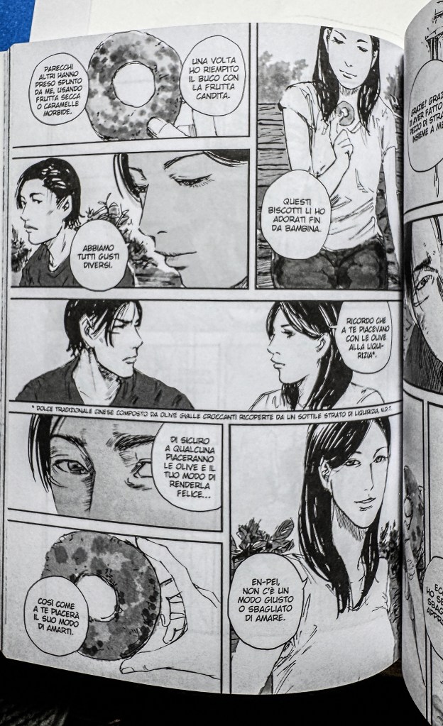
Personalmente ho apprezzato molto il personaggio di En Pei, proprio per la sua scelta (e anche perché è molto carino).
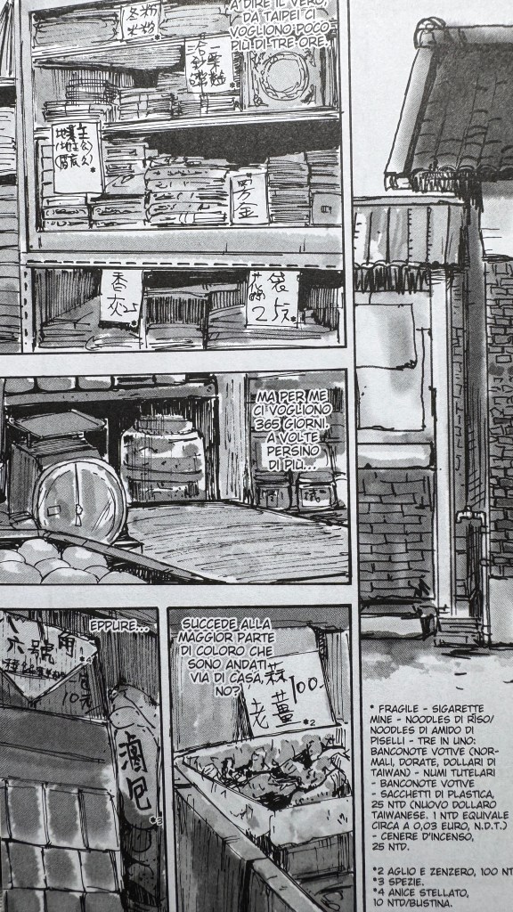
Da rimarcare lo splendido lavoro fatto dall’editore Toshokan sulla traduzione e sulle note, che hanno spesso occupato una parte considerevole dei margini.
Ruan Guang-min è anche un artista molto social e estremamente disponibile e alla mano: risponde sempre a tutti e tutte con parole di ringraziamento e gentilezza. Questo è il suo account Instagram, dove pubblica spesso anche disegni a colori da lasciare senza fiato.
The comic ends precisely with this sentence: if you accept the flaws, then it’s true love. Maybe it’s the same for manga? I’d say yes. The Corner Store — an old-fashioned grocery shop — is one of the best releases in recent years. Calling it “surprising” would be an understatement. Ruan Guang-min, a Taiwanese author, brings to life a group of ordinary, everyday characters who are far more interesting than the super-powered ones populating Japanese manga. Taiwanese manhua are still largely unexplored in Italy, even in their artistic peaks (such as Chen Uen or Little Thunder). Only recently has the publisher Toshokan started translating some of them, to great acclaim among more mature and refined readers.
Guang-min is very famous in his home country for his ensemble stories focused on small family-run businesses. He has won numerous awards, and his manhua have been adapted into TV series. The Corner Store definitely carries the pacing of a drama, not only in how events unfold but also in the way action is laid out on the page — the perspective, the framing. Guang-min is without a doubt one of the best artists currently available in Italian bookstores. His drawing technique is astonishing for its effectiveness, its vividness, and the speed with which the images come to life, feeling real and close. His ability to guide the reader’s eye and reading flow is extraordinary. In this, I consider him supreme, unreachable.
He draws digitally, but his linework always retains a handmade quality, with the smudges typical of charcoal or a soft pencil rubbed sideways on rough paper. You can still see the close lines of pencil and pen sketches, the finesse of the brush. Such attention to the tool used is practically unknown to many Japanese mangaka, who often offer clean, thin, flawless (and anonymous) lines — whereas in Europe, this more personal, handcrafted touch is highly appreciated because it reveals the artist’s individual hand. Uniqueness, recognizability, is always a positive element for European eyes, as it brings the artist closer to the divine act of creation.
The emotion this manhua stirred in me was an immense nostalgia for something I never actually had. I’m from Generation X — “corner stores” existed in my time; in fact, there weren’t any other kinds of shops. They were called “bottega”, “emporio”, “spaccio” — or, better yet, by the owner’s name: “I’m going to Carlino’s, Ieraci’s, Torre’s.” Or sometimes by their nickname: “Magnamagna” (Big Eater), “the Brigand”.
To me, they were terrible places — places you went because you had to, often for a family errand which, for a little girl, felt like an unbreakable command. Inside, I felt like a lamb among wolves, a piece of meat to be weighed, merchandise that could be plucked off a shelf. Even as a child, I could feel the foul breath of patriarchy on my neck. The scrutinizing stares of the “old men” (often barely forty) lingering on my elementary-school girl’s body as if I were a tasty, walking morsel. Adult women were either customers — thus fleeting presences — or the shop owners’ wives — mere extensions of their husbands. Little girls weren’t really welcome in those shops, not even if they were the owners’ daughters. Too many men, too many bad habits — alcohol, cigarettes, the ever-present risk of violence — and not least, the proximity to the world of money and business, from which females were carefully kept away.
So the idea that I could have waited for the bus at a shop, done homework together with other kids while munching on cookies — as happens to the protagonists in The Corner Store — felt like a stab in the ribs. This life, these memories, which were probably shared by many of my male peers, were denied to me simply because I was born female. And I wonder how far removed the little corner stores of rural Calabria in the ’70s and ’80s really are from those in Taiwanese provinces just a few years ago. I wonder if millennial girls in Taiwan, too, felt the weight of male gazes when buying a popsicle. And inevitably, I tell myself — yes, they did.
This thought both angers and saddens me.
In Guang-min’s story, there are female characters, but only three important ones compared to the countless male ones. All three are tied to romantic subplots, and only one has a strong characterization outside of sentimental themes. While the male characters have conversations about the meaning of life, emotions, and business, this kind of exchange doesn’t happen among the female characters, who merely overlap or brush against each other, often without meaningful interaction beyond sharing space on the page. There’s also no intergenerational bond among the women like there is around the male protagonist.
The reading experience remains very pleasant and truly moving. But there’s this constant hum, this background noise — the distortion caused by the absence of half the world. If Japanese manga are sadly notorious for this absence or for turning women into brainless dolls, in a story about ordinary people, one might have hoped for something better. Here, the underrepresentation of women isn’t an editorial choice: it feels natural, a mirror of society.
If I’m focusing on this aspect rather than the other many qualities of the comic, it’s for two reasons: First, because this series has already received plenty of praise and reviews discussing its technical and narrative strengths. Second, because I believe it’s crucial to highlight how often men describe only half the world (and how there are still too few female reviewers, often overly forgiving or not very attentive to gender representation). We women are very used to identifying with male characters — that’s why the female gaze shocks us so much, and partly why boy’s love stories are so incredibly popular.
Feeling excluded from a superhero story is painful; feeling excluded from a story about ordinary people is even worse — especially when the work is so beautiful. And The Corner Store is truly beautiful. The vitality of the narrative flow, the touching human themes, and the expressiveness of the characters make this manhua a true treasure — the kind of story you reread over time, finding yourself in it again and again (and yes, I’m using the masculine consciously) depending on your age and life choices.
What strikes directly, however, is Guang-min’s artistic skill: his style is bold yet stripped of frills, deeply focused on detail while still embracing the roughness of a sketch. A magic that few artists can achieve.
Personally, I really appreciated the character of En Pei, both for her choices and because — well — he’s also very handsome.
It’s worth highlighting the excellent work done by publisher Toshokan on the translation and notes, which often took up a significant part of the margins.
Ruan Guang-min is also a very social and extremely approachable artist: he always replies to everyone with words of gratitude and kindness. This is his Instagram account, where he often posts breathtaking illustrations.
"Quando guardiamo il cielo di notte ci soffermiamo ad ammirare le stelle a caso senza seguire uno schema.. lasciamo che la nostra fantasia si perda in questo immenso soffitto brulicante di luci... una stella grande.. qualcuna piccola.. un'altra azzurra ed una rossa! Luci lontane che forse ora non esistono neanche più.. eppure sono lì le guardiamo ogni sera quando le nuvole ce lo permettono.. luci che continuano a brillare .. a vivere.. che continuano a farci sognare! Questo BLOG vuole essere uno spazio semplice, senza pretese, uno spazio dove antichi sorrisi e sguardi continuano a brillare come stelle... semplicemente continuano a vivere nell'immenso cielo della rete." (Domenico Nardozza)