Hanashippanashi: Surprising and Delicate Magical Realism — A Multilingual Review – はなしっぱなし:驚きと繊細さを併せ持つマジック・リアリズム ― 多言語レビュー
Capita a volte di riconciliarmi col fumetto giapponese. Sono momenti rari e preziosi, di cui parlo volentieri. Quando sono tornata al vecchio amore del manga, dopo anni di assenza, credevo di trovarlo maturato, migliorato, incredibilmente avvincente. Non vi racconto neanche quale amarezza ho provato nel vedere che per certi versi era pure peggiorato, un po’ in marcescenza.
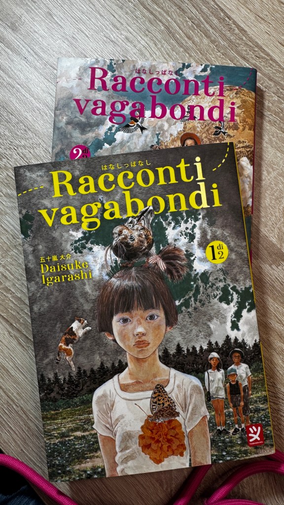
Occasionalmente compare un titolo che fa capire come l’avanzamento ci sia stato eccome, ma per varie ragioni non emerge. Mi è capitato ultimamente con Racconti vagabondi (Hanashippanashi) di Daisuke Igarashi, che mi ha colpita non appena spiccato dallo scaffale, per il disegno, che è uno dei fattori che maggiormente considero nella scelta dei manga.
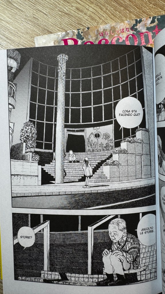
Racconti vagabondi è la prima pubblicazione di Igarsahi e risale al 1994. In Italia sono stati portati altri suoi titoli, come Designs e il più celebre Children of the sea, da cui è stato tratto anche un anime. Molto apprezzato e premiato in patria, ma considerato un autore di nicchia, qui in Italia non è molto noto. Racconti vagabondi è una raccolta di brevi storie, a volte brevissime, in cui il confine tra reale e favolistico, mitologico e irrazionale si dissolve, in favore di una contemplazione assorta e densa di perplessità. Infine, storia dopo storia, la perplessità si scioglie in una percezione alterata, in cui la posizione esterna del lettore/osservatore diventa parte integrante del racconto, accolta sia come un altro degli strati dimensionali possibili, sia come fuoco di una intradimensionalità che attraversa tutte le storie.
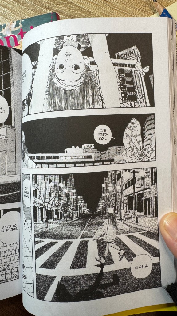
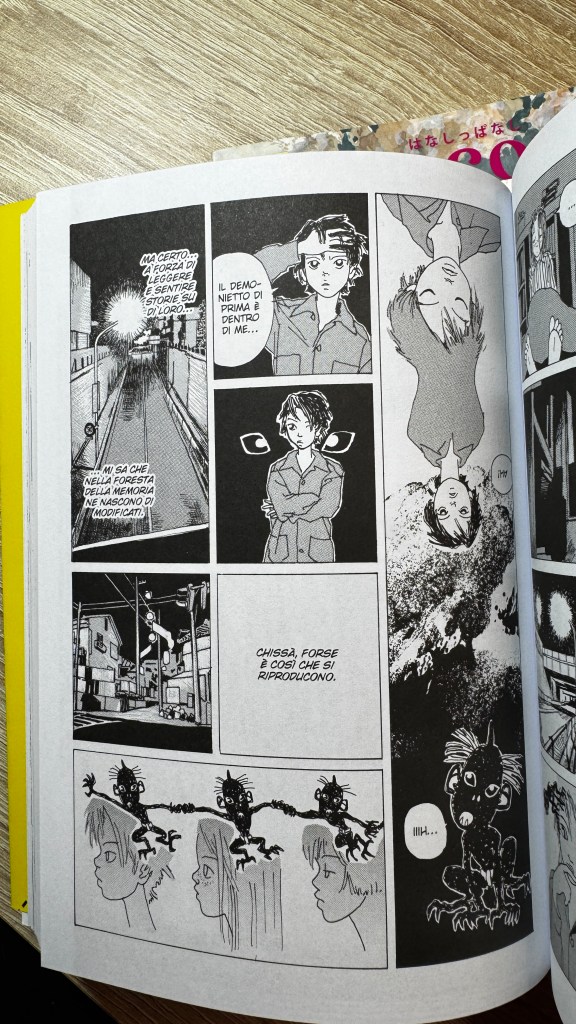
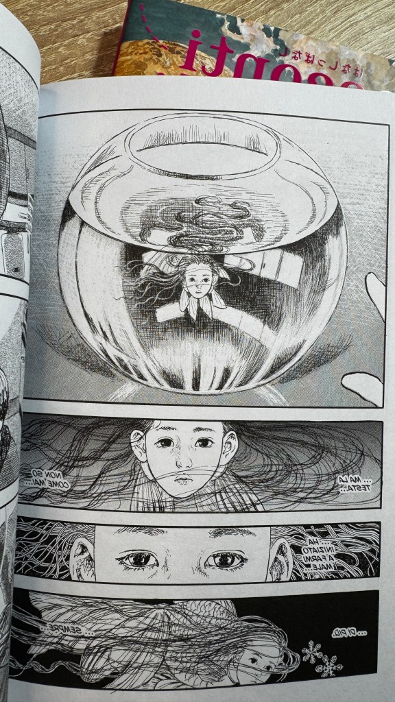
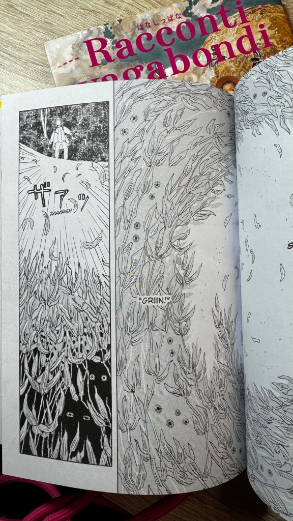
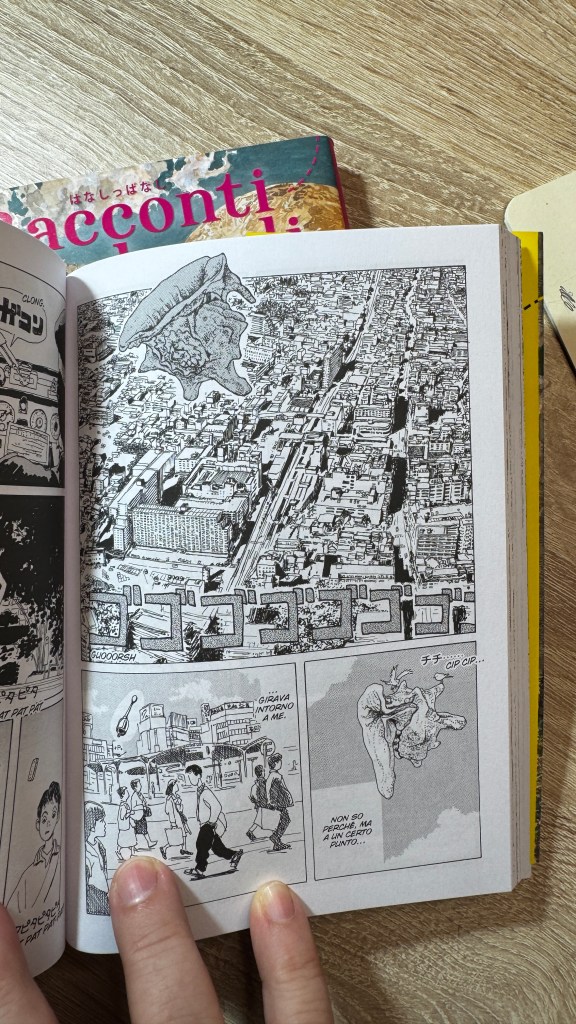
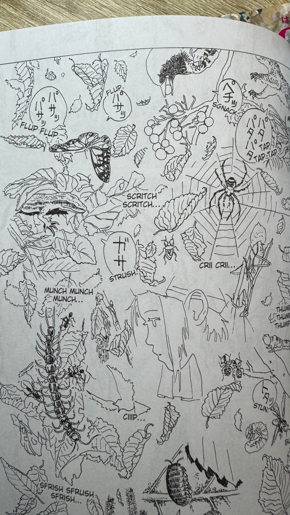
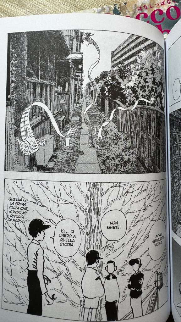
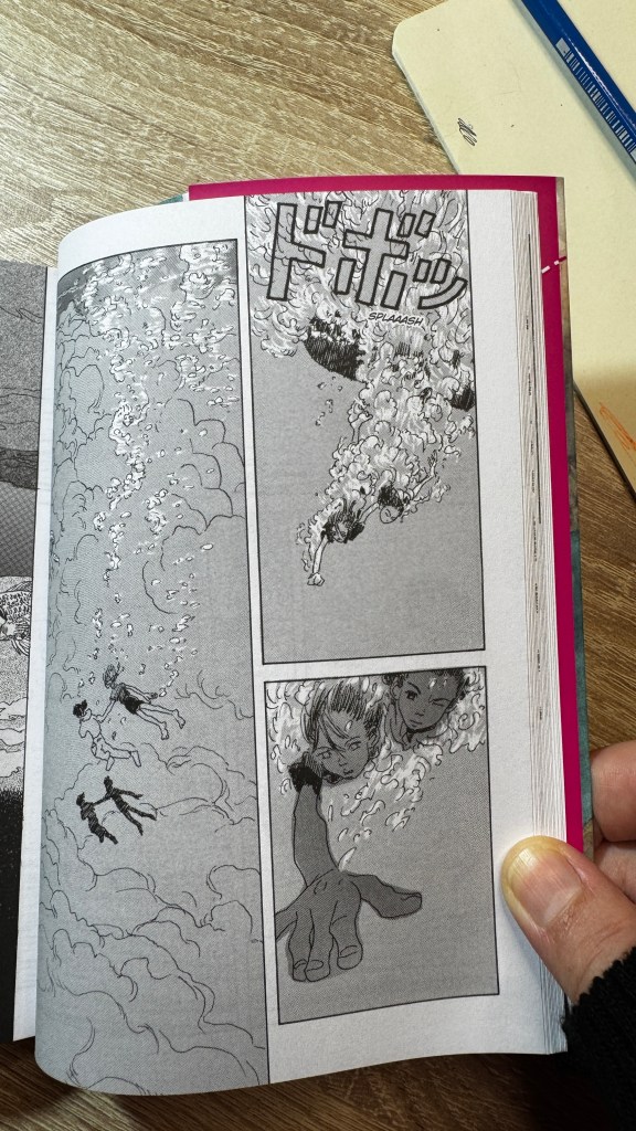
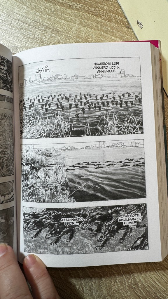
Fortissimo è il carattere di hybris, che prende di volta in volta fisionomie differenti di creature davvero, davvero strane, non necessariamente confinate nel folklore, ma che abbracciano anche la contemporaneità. Anche le figure di animali “normali”, attraverso un segno grafico scavato e sottile, diventano mostruose. L’ibrido non è solo grafico, ma anche contenutistico: la pluralità imbricata di codici visivi e narrativi, crea una vera e propria distorsione cognitiva, tanto che diventa irrilevante comprendere la dinamica della storia, quanto contemplarla, farne parte. Le storie sono aperte, non devono essere interpretate, ma assorbite. Per godere appieno della lettura consiglio di spezzarla il meno possibile, poiché la sensazione di smarrimento si dissolve per accumulo.
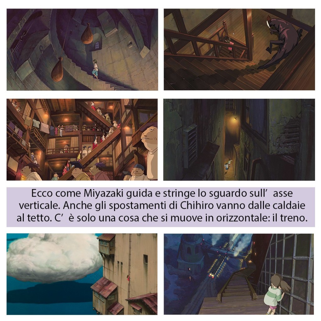
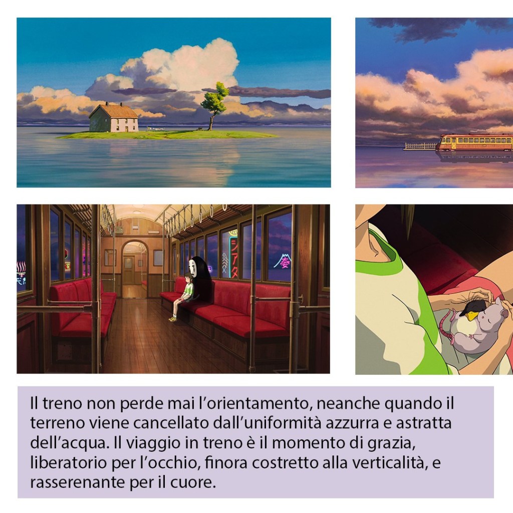
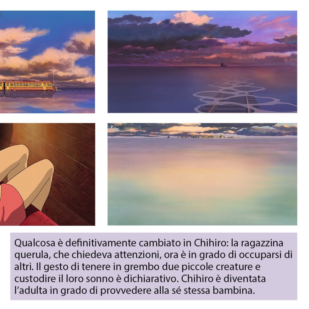
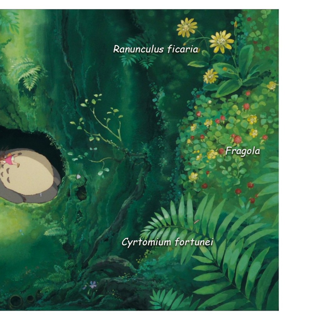
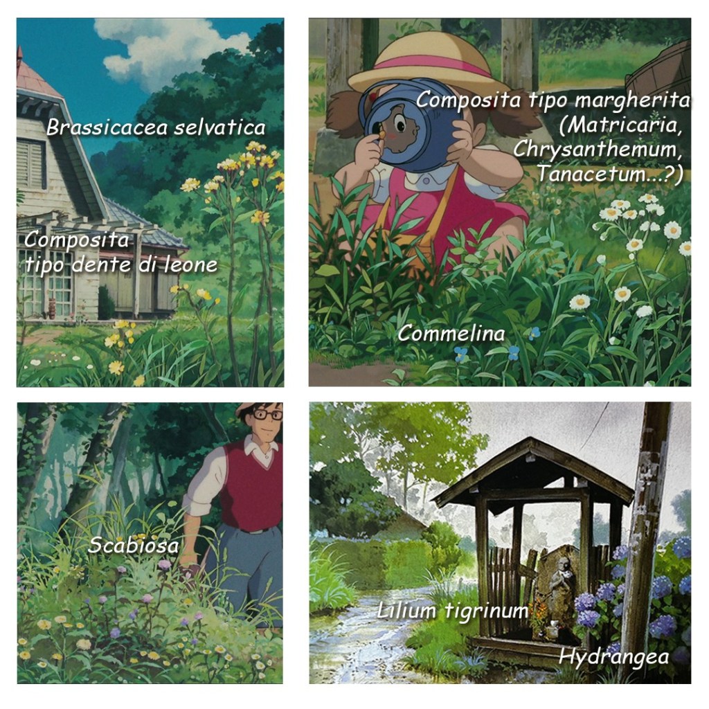
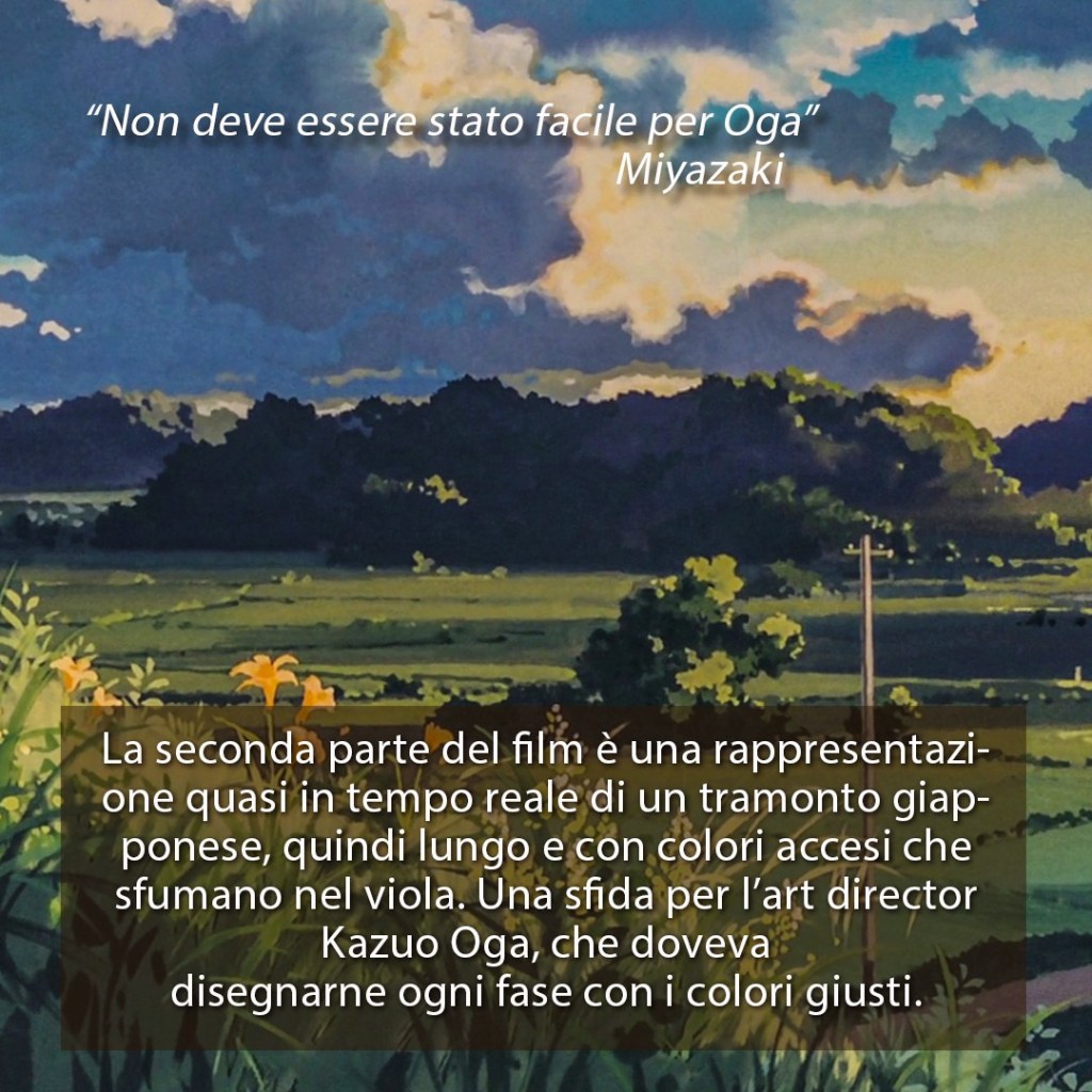
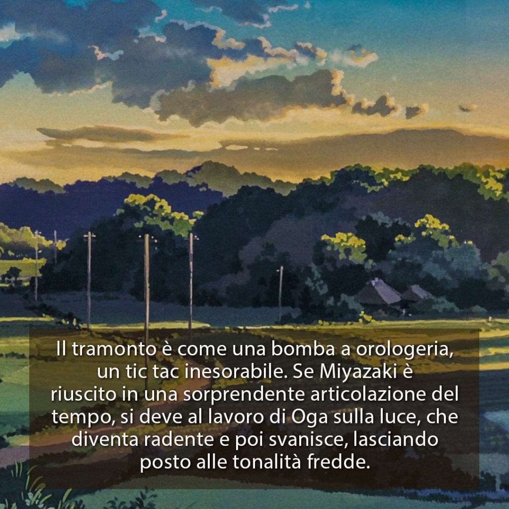
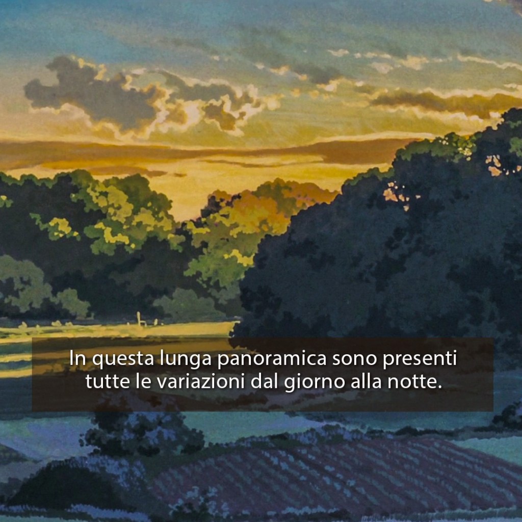
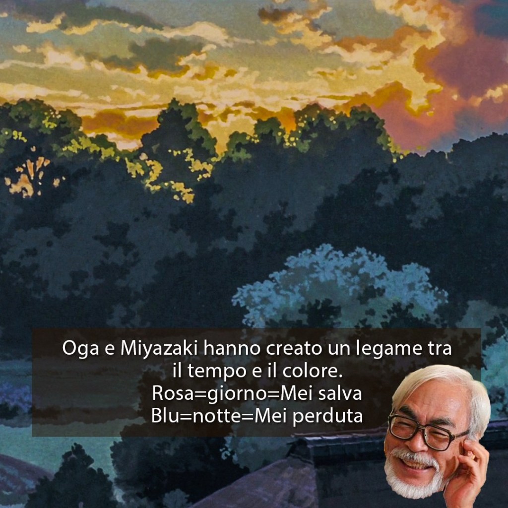
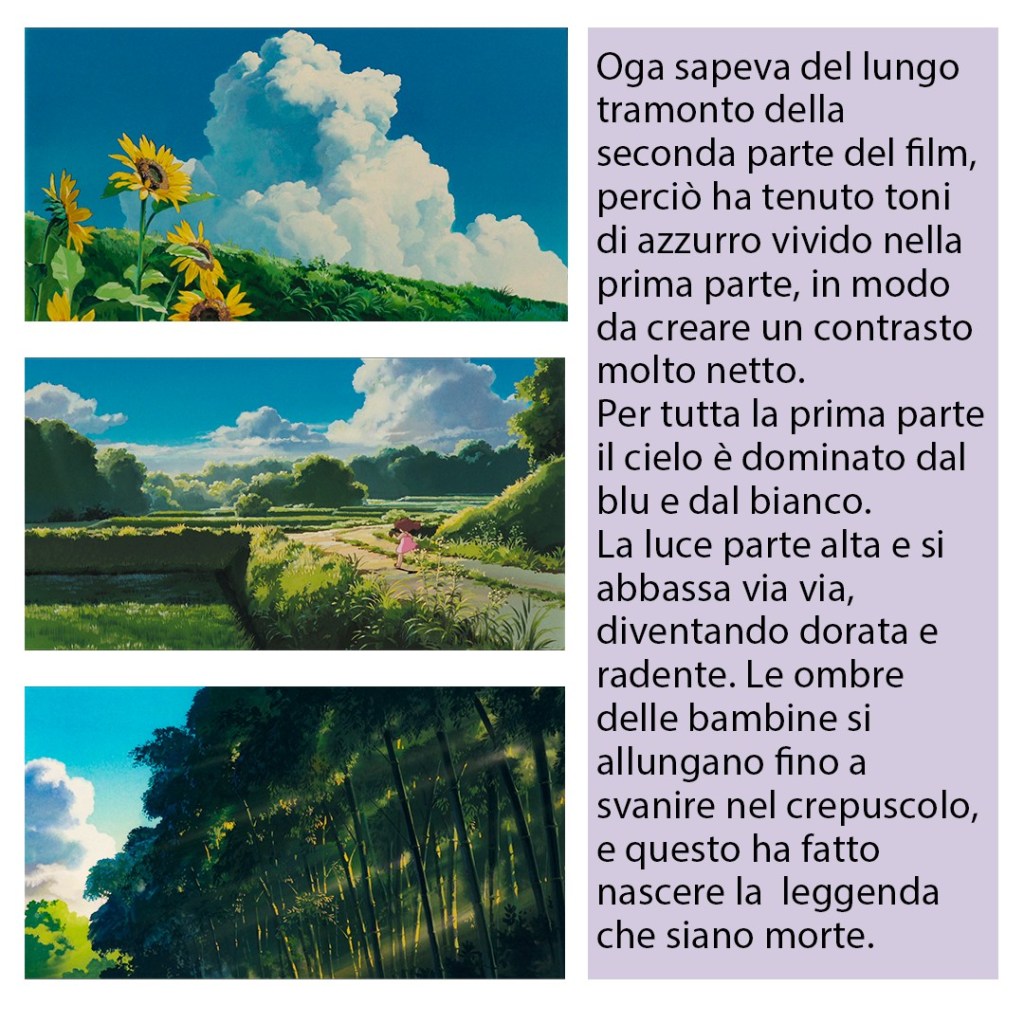
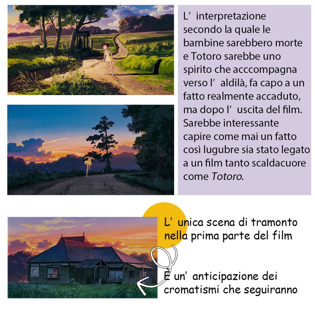
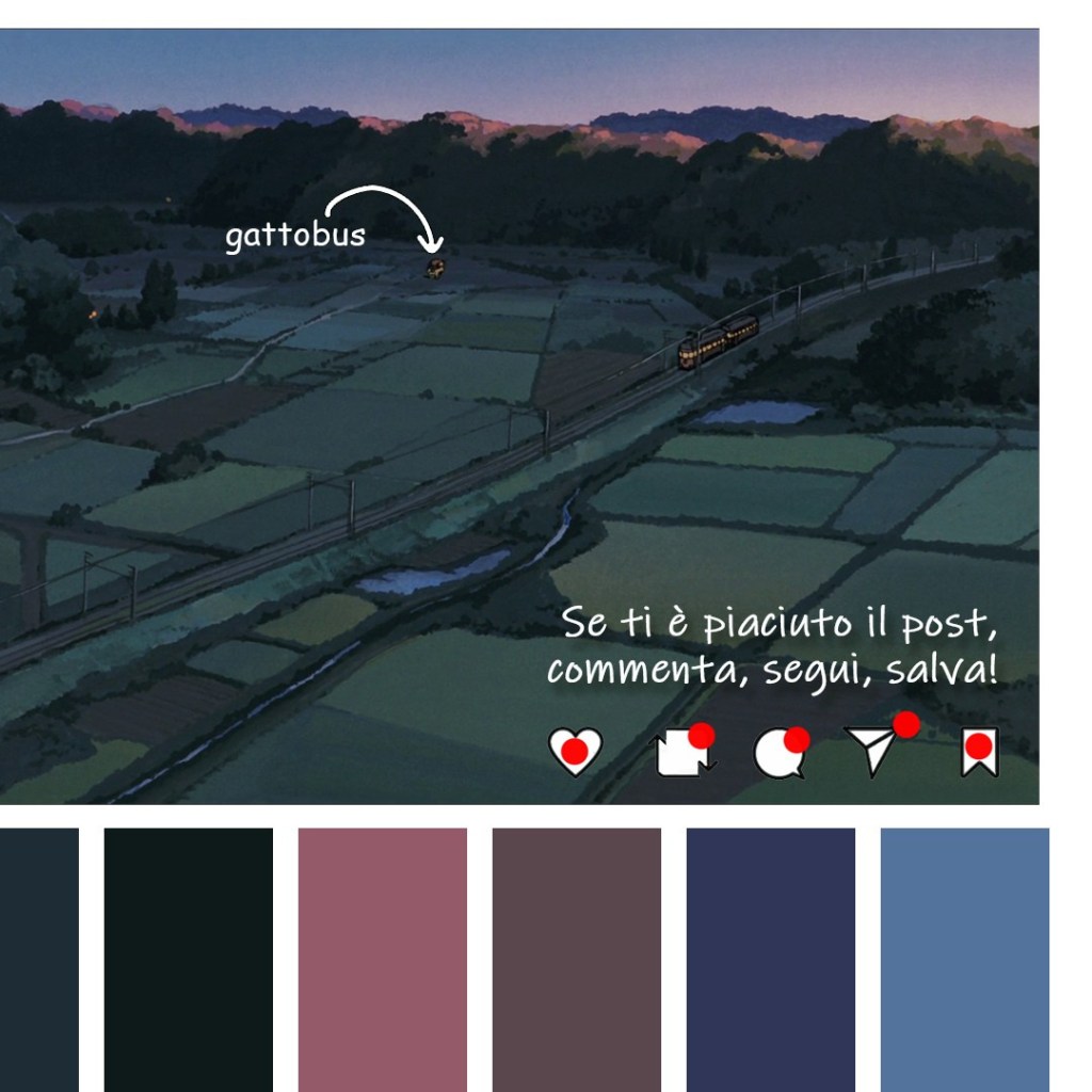
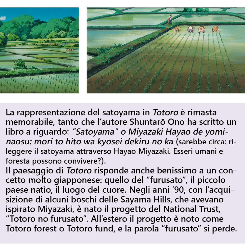
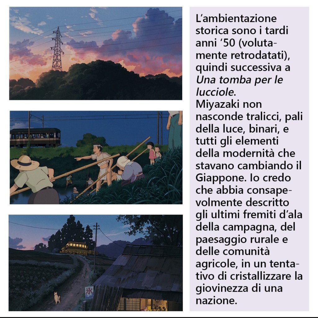
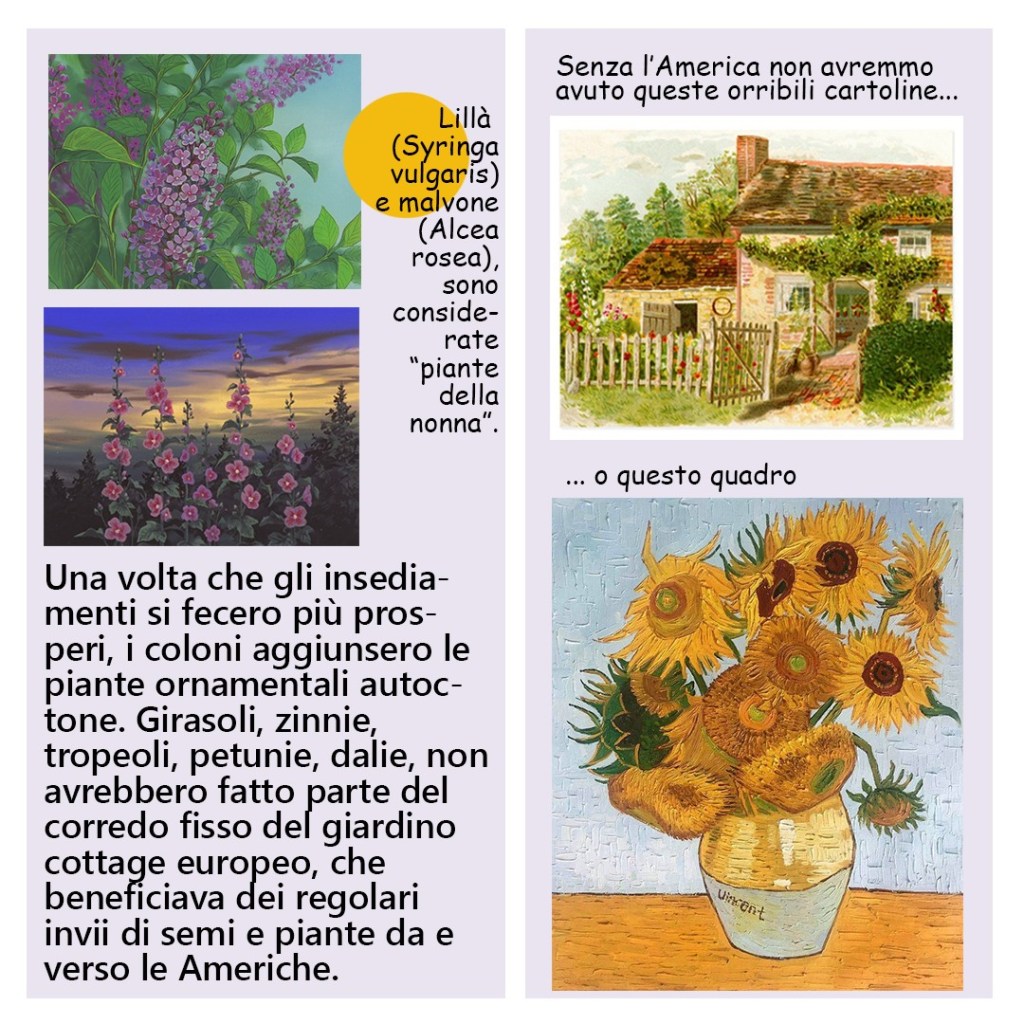
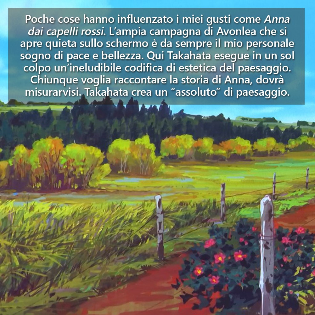
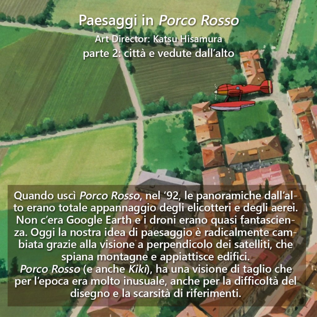
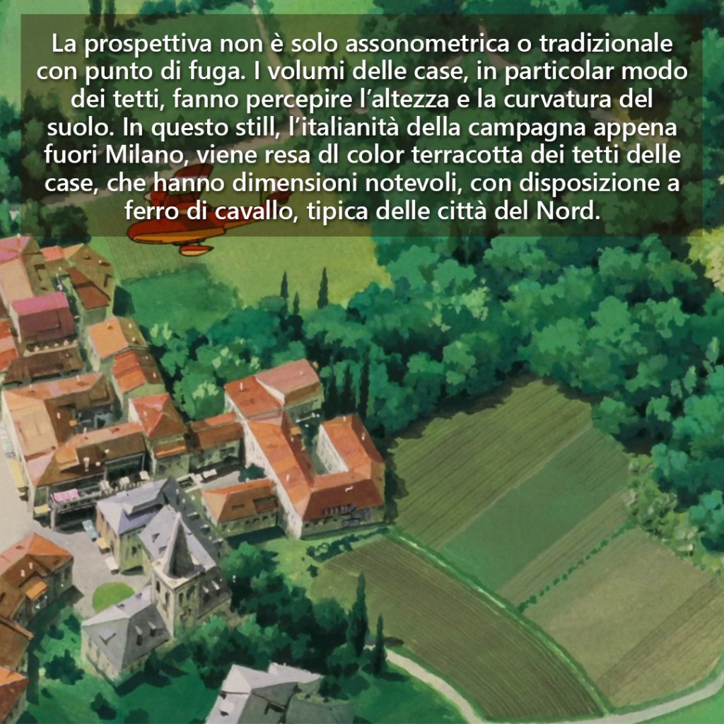
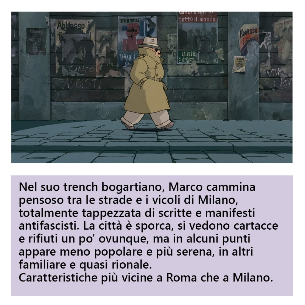
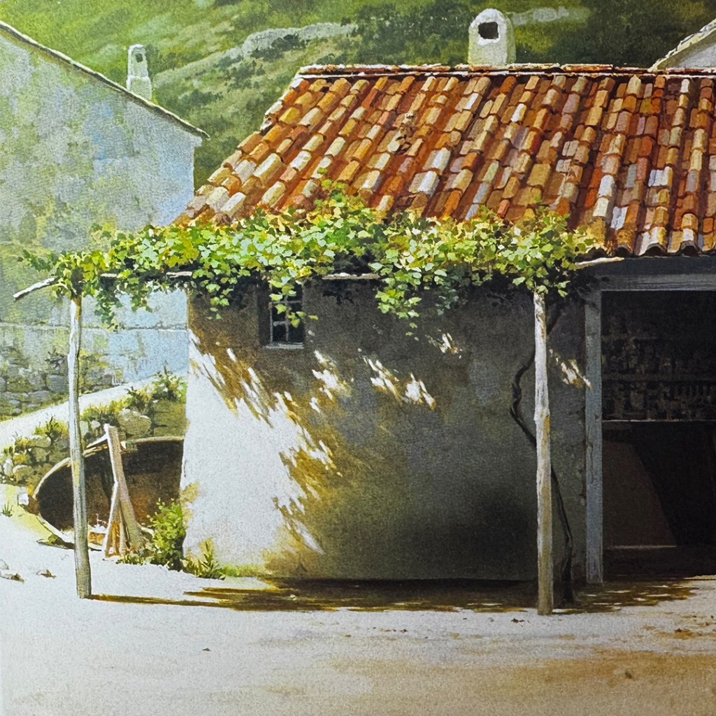
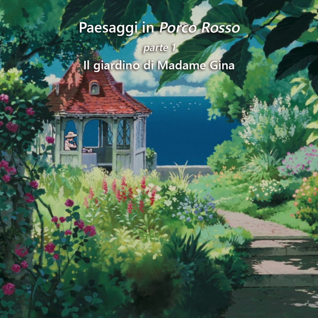
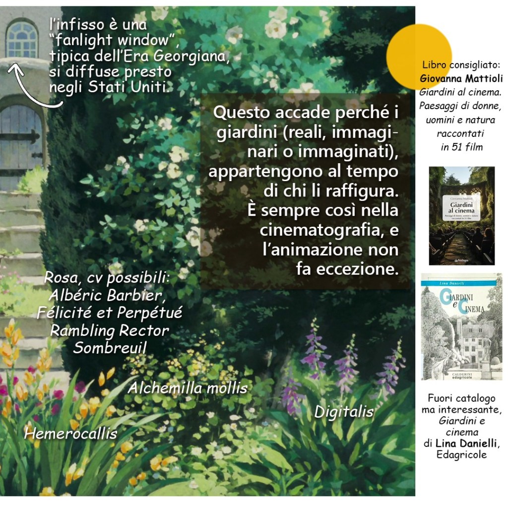
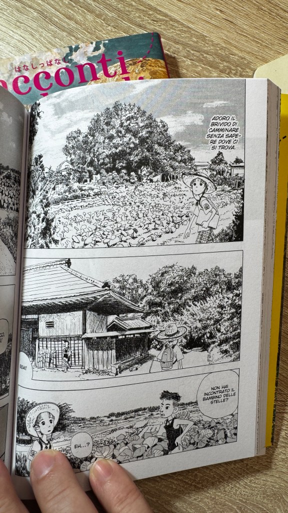
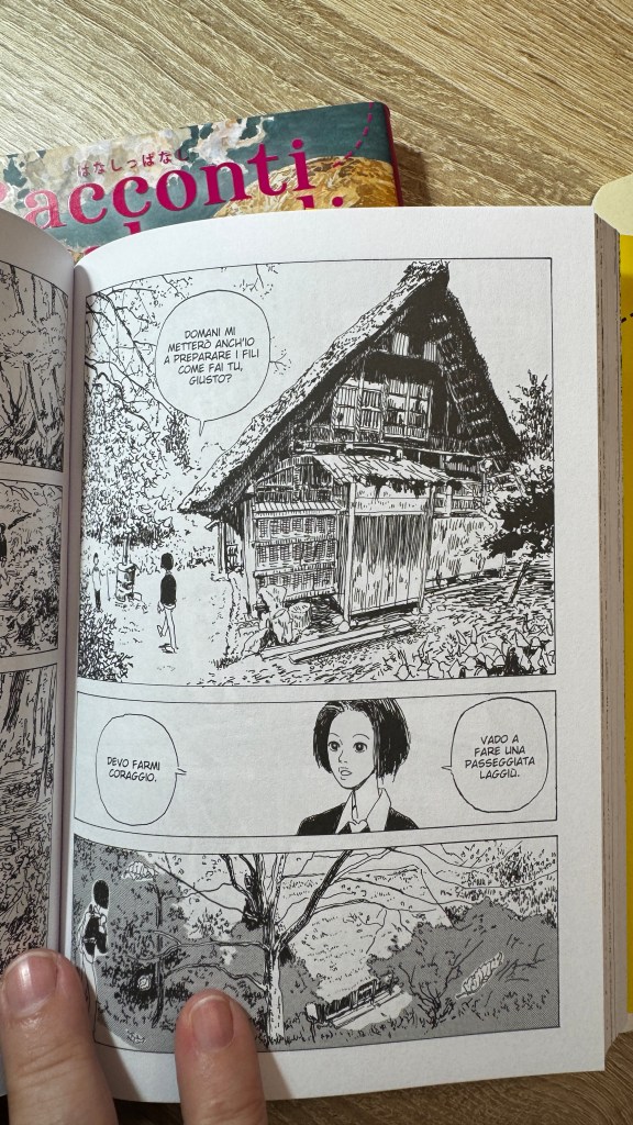
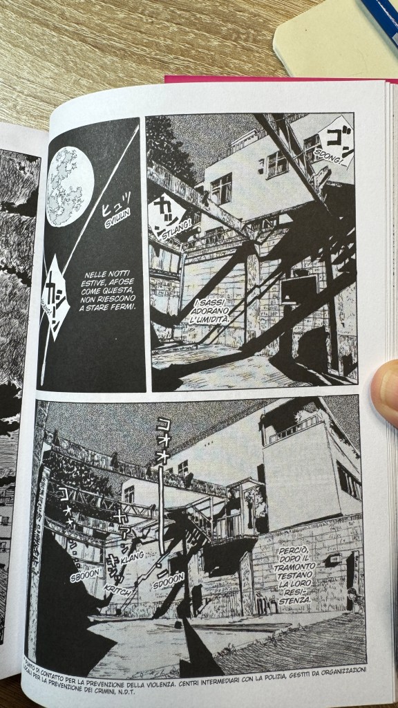
La cosa davvero realistica e solida è il paesaggio, che rimane sempre quello, il nostro, la realtà comunemente esperibile. Il paesaggio è un’ancora visiva e cognitiva senza la quale la dissonanza percettiva non sarebbe possibile. Ecco perché sono stati fatti paragoni tra Igarashi e Miyazaki, ma l’uso del paesaggio dei due autori è del tutto antitetico. Miyazaki fa un uso politico e sociale del paesaggio, in Igarashi è la costante attorno a cui si sviluppano mille variabili. La sicurezza nel paesaggio consente anche di non sentire ansia nella lettura: il racconto potrebbe finire la pagina dopo sennza troppi scossoni. Maggiore affinità invece è con l’opera di Inio Asano, anche lui un devoto del paesaggio urbano, con la differenza che Asano cala in pagina il riferimento poco o nulla elaborato, mentre Igarashi lo tiene su un livello sotto e lo rilavora a mano: una personale scelta che implica anche un passaggio in più e che mette una certa distanza stilistica tra i due.
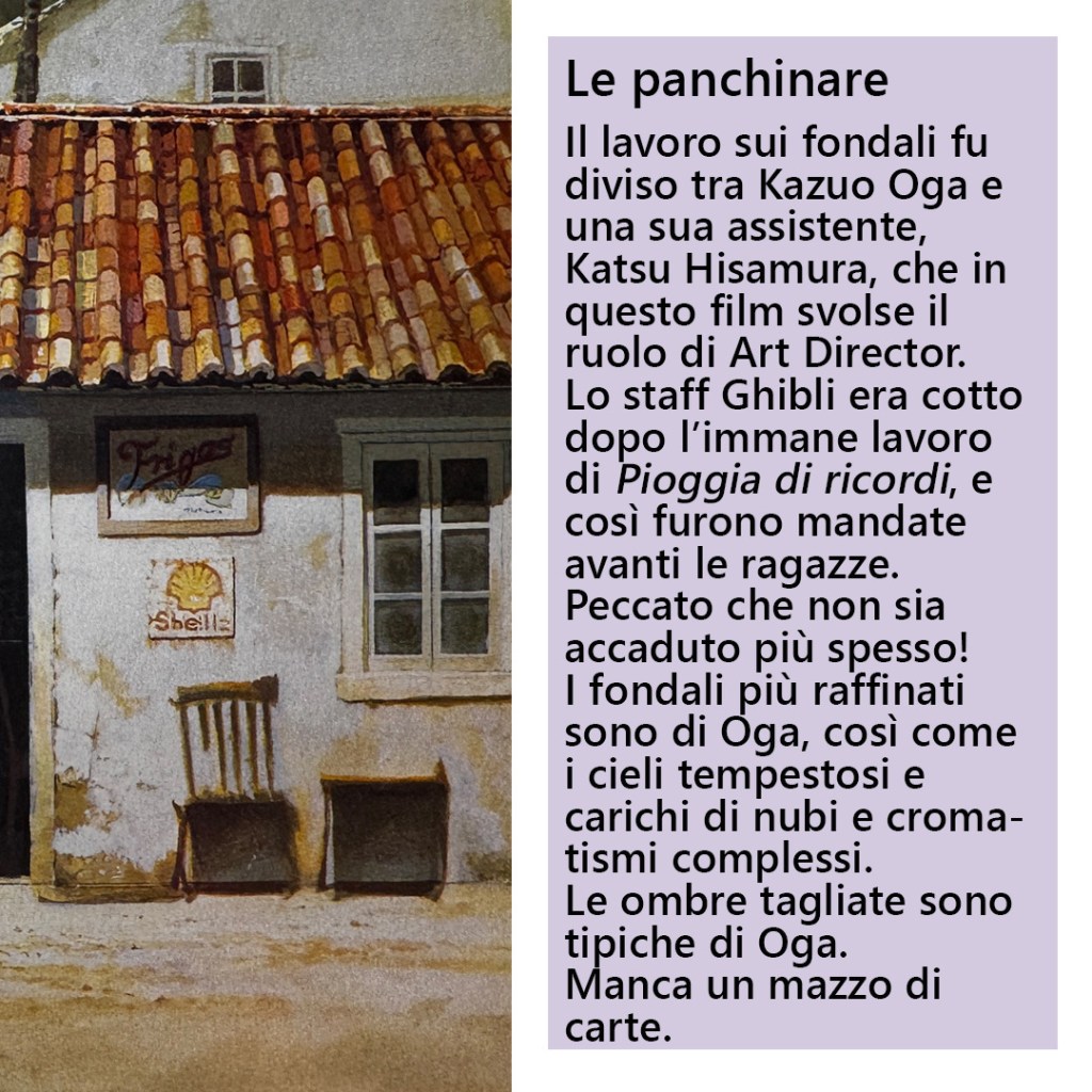
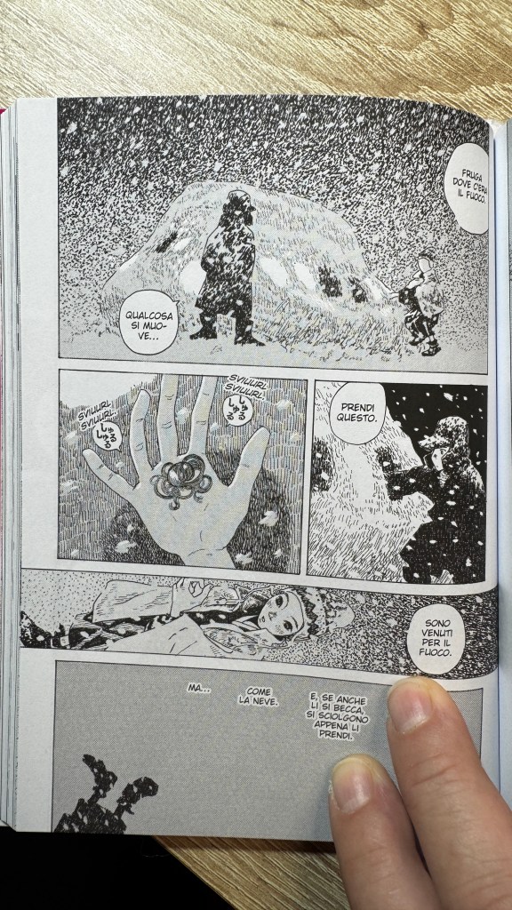
Lo stile è complesso ed estremamente personale, il segno affilato deve certamente qualcosa all’underground, ma è incredibilmente dolce e delicato. Questo imbricamento tra apparente bruttezza, delicatezza e poesia della rappresentazione e dei contenuti, è per me la cifra stilistica di Igarashi, ed è rarissima, per non dire unica. In una intervista alla fine del primo volume, Igarashi dice di avere lavorato molto con la school pen. La maggior parte dei manga sono disegnati con la famosa G-pen (in realtà un pennino). La school-pen (anche questa un pennino), è un po’ più sottile. Da qui deriva il segno affilato di Racconti vagabondi.
Una particolarità forse passata inosservata ai più, sono delle piccole variazioni di stile per adattare il segno alla narrazione (Igarashi conferma nell’intervista), cosa di cui in effetti non ci sarebbe stato bisogno.
Personalmente ho gradito più il primo volume, il secondo contiene delle storie a volte didascaliche non all’altezza delle precedenti.
This text was translated into English and Japanese with the assistance of ChatGPT (OpenAI).
Sometimes I find myself reconciling with Japanese comics. These are rare and precious moments, and I speak of them gladly. When I returned to my old love of manga after years of absence, I believed I would find it matured, improved, incredibly compelling. I will not even tell you the bitterness I felt when I discovered that, in certain respects, it had actually deteriorated, showing signs of decay.
Occasionally, however, a title appears that makes it clear that real progress has indeed taken place, though for various reasons it does not fully emerge. This recently happened to me with Hanashippanashi by Daisuke Igarashi, which caught my attention as soon as it stood out from the shelf thanks to its artwork—one of the elements I consider most when choosing manga.
Hanashippanashi is Igarashi’s first publication and dates back to 1994. In Italy other titles by the author have been published, such as Designs and the more widely known Children of the Sea, from which an animated film was also produced. Highly regarded and award-winning in Japan, though considered something of a niche author, he remains relatively little known here in Italy.
Hanashippanashi is a collection of short stories—sometimes extremely short—in which the boundary between the real and the fairy-tale, the mythological and the irrational dissolves, giving way to a contemplative atmosphere dense with perplexity. Gradually, story after story, that perplexity resolves into an altered perception, in which the external position of the reader-observer becomes an integral part of the narrative itself, accepted both as one of the possible dimensional layers and as the focal point of an intradimensionality that runs through all the stories.
The presence of hybris is extremely strong, taking on different forms each time in the shape of truly, truly strange creatures, not necessarily confined to folklore but also embracing contemporary settings. Even figures of “ordinary” animals, through a carved and subtle graphic line, become monstrous. The hybrid element is not merely visual but also conceptual: the interwoven plurality of visual and narrative codes produces a genuine cognitive distortion, to the point that understanding the dynamics of the story becomes less important than contemplating it and becoming part of it. The stories are open-ended; they are not meant to be interpreted but absorbed. To fully appreciate the reading experience, I would recommend interrupting it as little as possible, since the initial feeling of disorientation dissolves through accumulation.
The truly realistic and solid element is the landscape, which always remains the same: our own, the reality we commonly experience. The landscape functions as a visual and cognitive anchor, without which perceptual dissonance would not be possible. This is why comparisons have sometimes been drawn between Igarashi and Hayao Miyazaki. Yet the two authors use landscape in entirely opposite ways. Miyazaki employs landscape in a political and social sense, whereas in Igarashi it becomes the constant around which countless variables develop. This stability of landscape also prevents the reading experience from becoming anxious: the story might simply end on the next page without any dramatic rupture.
A stronger affinity can instead be found with the work of Inio Asano, who is also deeply devoted to urban landscapes. The difference, however, is that Asano places the reference on the page with little or no elaboration, while Igarashi keeps it one level beneath and reworks it by hand—a personal choice that implies an additional step and establishes a certain stylistic distance between the two.
The style is complex and extremely personal. The sharp line certainly owes something to underground comics, yet it is also incredibly gentle and delicate. This interweaving of apparent roughness, delicacy, and poetic representation—both visually and thematically—is, to me, Igarashi’s stylistic hallmark, and it is exceedingly rare, if not unique.
In an interview included at the end of the first volume, Igarashi mentions that he worked extensively with a school pen. Most manga are drawn with the famous G-pen (actually a type of nib). The school pen—also a nib—is somewhat thinner, which explains the sharp line characteristic of Hanashippanashi.
Another detail that may have gone unnoticed by many readers is the presence of small stylistic variations designed to adapt the line to the needs of the narrative (something Igarashi confirms in the interview), though in fact this adjustment might not have been strictly necessary.
Personally, I preferred the first volume. The second contains some stories that at times become didactic and do not quite reach the level of the earlier ones.
本稿の英語版および日本語版の翻訳には、ChatGPT(OpenAI)の補助を用いています。
ときどき、私は日本の漫画と和解する瞬間がある。そうした瞬間は決して多くない。だが稀であるからこそ、なおさら貴重であり、語りたくなる。長いあいだ離れていた漫画の世界に戻ったとき、私はそれが成熟し、より洗練され、かつて以上に魅力的なものへと成長しているだろうと期待していた。ところが実際には、ある側面ではむしろ衰え、どこか停滞や疲労の気配さえ漂わせていることに気づき、少なからず落胆させられた。
しかし、ごくまれにではあるが、「確かに前進はあったのだ」と思わせる作品が現れる。そして不思議なことに、そうした作品は必ずしも広く知られるわけではない。最近、私にとってそのような出会いとなったのが、Daisuke Igarashiの『はなしっぱなし』である。書棚のなかでまず目を引いたのは、その独特の作画だった。私が漫画を手に取るとき、絵はもっとも重要な判断材料のひとつだからだ。
『はなしっぱなし』は五十嵐のデビュー作であり、1994年に発表された短編作品集である。イタリアではすでに『Designs』や、より広く知られる『Children of the Sea』などが紹介されている(後者はアニメ映画化もされている)。日本では高く評価され、数々の賞を受けている作家であるが、その作風ゆえにいわゆる“ニッチな作家”と見なされることもあり、イタリアではまだ広く知られているとは言い難い。
『はなしっぱなし』に収められているのは短編、あるいはごく短い掌編の数々である。そこでは現実と寓話、神話、そして不条理の境界が曖昧に溶け合い、読者は一種の沈思的な観想の場へと導かれる。読み進めるにつれ、最初に感じられる戸惑いは次第に変質していく。読者はもはや外側から物語を眺める存在ではなく、むしろ物語の内部に組み込まれ、ひとつの次元として、あるいはすべての物語を横断する知覚の焦点として機能しはじめる。
作品全体には強い**ヒュブリス(hybris)**の気配が流れている。それはしばしば、実に奇妙な姿をした存在として現れる。しかもそれらは必ずしも民俗的想像力の領域にとどまらず、現代の風景のなかにも自然に入り込んでいる。さらに興味深いのは、いわゆる普通の動物でさえ、五十嵐の鋭く掘り込むような線によって描かれると、どこか怪物めいた印象を帯びる点である。
このハイブリッド性は視覚表現だけに限られない。物語の構造そのものにも及んでいる。複数の視覚的コードと語りの形式が重なり合うことで、読者の認知にはわずかな歪みが生じる。結果として、物語の因果関係を理解することはさほど重要ではなくなる。むしろ重要なのは、それを眺め、そこに身を置き、物語の内部に入り込むことである。これらの物語は開かれている。解釈されるためというより、むしろ体験され、吸収されるための物語なのだ。読書を最大限に味わうためには、なるべく中断せずに読み進めることを勧めたい。最初に感じた違和感は、物語が積み重なるにつれて徐々にほどけていくからである。
この作品のなかで唯一確かな現実性を保っているのが風景である。そこに描かれているのは、私たちが日常的に経験している世界そのものだ。風景は視覚的・認知的な錨として機能し、それがあるからこそ知覚の揺らぎが成立する。この点から、五十嵐とHayao Miyazakiを比較する声もある。しかし両者の風景の扱いは本質的に異なる。宮崎において風景は社会的・政治的な意味を帯びるが、五十嵐にとってそれは、無数の変化が展開するための恒常的な基盤である。風景が安定しているからこそ、読者は不安を感じることなく物語の流れに身を委ねることができる。極端に言えば、物語は次のページで何事もなく終わるかもしれないのだ。
むしろ親近性を感じさせるのは、Inio Asanoの作品である。浅野もまた都市の風景に強い関心を寄せる作家である。ただしその方法は異なる。浅野が参照した風景をほとんど加工せずページ上に配置するのに対し、五十嵐はそれをいったん距離を置いて再構成し、手で描き直す。この選択は制作工程を一段増やすことになり、両者のあいだに明確な様式的差異を生み出している。
五十嵐の作画は複雑で、きわめて個性的である。鋭く細い線にはアンダーグラウンド・コミックスの影響が感じられるが、同時に驚くほど柔らかく、繊細でもある。粗さと優しさ、そして詩的な感覚が同時に共存するこの独特のバランスこそが、五十嵐の作家性を特徴づける要素であり、きわめて稀有なものと言えるだろう。
第1巻の巻末インタビューによれば、五十嵐はスクールペンを多用しているという。一般的な漫画制作ではGペンが使われることが多いが、スクールペンはそれよりも細い線を出すことができる。この違いが、『はなしっぱなし』の鋭く緊張感のある線を生み出している。
さらに興味深い点として、物語ごとにわずかな作画の変化が見られることが挙げられる(これについては本人もインタビューで言及している)。厳密に言えば必ずしも必要な工夫ではなかったかもしれないが、それでもあえて取り入れているところに、作者の細やかな意識が感じられる。
個人的な印象としては、第1巻の完成度がとりわけ高いように思われた。第2巻には、やや説明的で、前の短編ほどの強度を感じさせない作品も含まれている。
–有時候,我會與日本漫畫重新和解。這樣的時刻並不常見,因此也格外珍貴,我總是樂於談起。多年之後再次回到曾經熱愛的漫畫世界時,我原以為它已經變得更加成熟、更出色,也更加引人入勝。然而很遺憾地,我很快發現,在某些方面它甚至有所退步,甚至帶著一點衰敗的氣息。
不過偶爾還是會出現一些作品,讓人意識到漫畫其實確實有所前進,只是由於各種原因並沒有真正浮出主流視野。最近我就遇到了這樣的一部作品:五十嵐大介的《はなしっぱなし》(義大利語版名為《Racconti vagabondi》)。最初吸引我的是它在書架上格外醒目的畫風。對我而言,在選擇漫畫時,作畫始終是最重要的因素之一。
《はなしっぱなし》是五十嵐大介於1994年發表的出道作品。義大利曾出版過他的其他作品,例如《Designs》以及更為知名的《海獸之子》(Children of the Sea),後者也被改編為動畫電影。五十嵐在日本受到高度評價,也獲得過多項獎項,但由於其創作風格較為獨特,他常被視為一位小眾作家,因此在義大利仍不算廣為人知。
《はなしっぱなし》是一部短篇漫畫集,其中有些故事甚至非常短小。在這些作品中,現實與寓言、神話以及非理性的界線逐漸消融,取而代之的是一種沉靜而充滿困惑的凝視。隨著一篇又一篇故事的展開,這種困惑逐漸轉化為一種不同的感知方式:讀者不再只是站在外部觀看故事,而是逐漸被納入敘事之中,既像是另一個可能的維度層次,也像是一個貫穿所有故事的內在焦點。
作品中強烈地存在著一種**hybris(僭越)**的氣息。這種力量不斷以不同的形態出現,往往化為極其奇異的生物。有趣的是,這些生物並不一定侷限於民間傳說之中,它們同時也存在於現代世界的背景裡。甚至連那些看似普通的動物,在五十嵐細長而深刻的線條之下,也會呈現出某種怪物般的氣質。
這種混合性不僅體現在圖像上,也存在於內容之中。多種視覺與敘事符號的交織,產生了一種真正的認知扭曲,以至於理解故事的情節發展變得不再那麼重要,反而是去凝視它、沉浸其中、成為其中一部分更加重要。這些故事是開放的,它們並不是為了解釋,而是為了被吸收與體驗。為了更好地享受閱讀,我建議盡量不要中斷閱讀,因為最初的迷失感會在故事的累積中逐漸消散。
在整部作品中,唯一真正穩固而現實的元素是風景。那始終是我們熟悉的世界,是日常可經驗的現實。風景成為一種視覺與認知的錨點,沒有它,感知上的不協調就不可能成立。也正因如此,有人將五十嵐與宮崎駿相提並論。然而兩人對風景的運用其實完全不同。宮崎駿往往將風景作為一種社會或政治性的表達,而在五十嵐的作品中,風景則是所有變化所圍繞的一個恆定核心。正因為風景提供了這種穩定感,讀者在閱讀時也不會感到焦慮:故事甚至可能在下一頁突然結束,而不需要任何戲劇性的衝擊。
若要尋找更接近的創作關係,也許可以提到淺野一二〇。他同樣非常關注城市風景。不過兩人的方法仍然不同:淺野往往直接將現實景觀幾乎不加處理地放入畫面,而五十嵐則會先保持一種距離,再以手繪方式重新詮釋。這是一種個人的創作選擇,也意味著多了一道創作步驟,使兩位作者在風格上保持明顯差異。
五十嵐的畫風複雜而極具個人特色。那種鋒利細長的線條確實帶有地下漫畫的影響,但同時又顯得極為溫柔與細膩。這種表面上的粗獷、內在的柔和,以及畫面與內容中的詩意彼此交織,正是我認為最能代表五十嵐風格的特徵,而這樣的特質在漫畫中極為罕見。
在第一卷結尾的訪談中,五十嵐提到自己大量使用 school pen(學生筆尖) 作畫。多數漫畫家通常使用 G-pen,而 school pen 的線條更細。正是這種工具的選擇,使《はなしっぱなし》呈現出那種銳利而緊張的線條。
還有一個也許被許多讀者忽略的細節:為了配合不同故事的敘事氣氛,作者在畫風上做了一些細微的變化(他在訪談中也證實了這一點)。其實從嚴格意義上說,這樣的調整並非必須,但它仍然顯示出作者對表現形式的高度敏感。
就個人而言,我更喜歡第一卷。第二卷中有些故事略顯說教,整體完成度也不如前一卷。